


10
meiAngular Material Dialog Component
22 dec. 2023
Intermediate
50,1K Views
13 min read
Angular Material Dialog Component: An Overview
In this Angular material tutorial, we'll look at Angular Material's dialogue component, including how to integrate it into an Angular application, how to transmit data between the dialogue and other components, and other important details. The dialogue is a popular element for quickly getting user input. When users complete the form input within the dialogue, it closes and the values of the dialogue element are processed. Certain factors must be addressed before developing and using a simple dialogue step by step to make use of the Angular Material dialogue component in our Angular application.Simple Dialog
Angular Material's Simple Dialogues offer a simplified method of obtaining user input or presenting targeted information in a modal overlay, hence improving user experience and interactivity. In our first example, we are going to use the simple material dialog component and for that, we need to follow a few steps as described below.
Step 1
To use the dialog component, we need to import the MatDialogModule module into the app module like this.
App.module.tsimport { MatDialogModule } from '@angular/material/dialog';
After importing the dialog module, the next step is to include it inside the imports array as given below.
imports: [
 CommonModule,
 MatCardModule,
 MatDialogModule
 ]
We have configured the dialog module into the app, after doing it, we can use the dialog component in the template.
Step 2
We have imported a dialog module in our root module file, to open the dialog; we need to create a dialog box with its title, content, and action buttons so that we can do some action based on the button click event. For that, we need to create a new component and implement a dialog body inside the same component.
simpleDialog.component.tsimport { Component } from '@angular/core';
import { MatDialog, MatDialogRef, MAT_DIALOG_DATA } from '@angular/material';
@Component({
template: `
<h1 mat-dialog-title>Hello There</h1>
<div mat-dialog-content>
<p>This Is a Simple Dialog</p>
</div>
<div mat-dialog-actions>
<button mat-button (click)="close()">Close</button>
</div>
`
})
export class SimpleDialogComponent {
constructor(
public dialogRef: MatDialogRef<SimpleDialogComponent>) { }
close(): void {
this.dialogRef.close();
}
}
In the above source code, I have implemented a few changes as described below in brief.
- Created the independent/reusable dialog component file so that we can include the same file at multiple components to integrate the dialog component
- Designed a modal dialog body with a title, content, and action button to close the dialog box
- I have used MatDialogRef which emits the event when dialog will be opened when any action triggers either by button click or via other events.
- And created a simple dialog close event which is used to close the dialog when the user clicks on a close button presented inside the dialog component's footer section which is called mat-dialog-actions.
Step 3
We have created a dialog body as a separate component or we can say an independent re-usable component, but when we want to use it inside any other components; we need to add it inside the entry component that injects any outer component into the existing one.
The reason is that the dialog component will not be loaded when our angular application is rendered into the browser, but the dialog component will be added later into the DOM when we try to open it, in short, our dialog component will be rendered later on. For that open the App.module.ts file and add it like this.
App.module.tsFirst, we need to import it like this.
import { SimpleDialogComponent } from './dialog-component/simpleDialog.component';
// Then add it into declaration like this.
 declarations: [
 AppComponent,
 SimpleDialogComponent,
 ],

// And also we need to specify inside entryComponents array something like this.
 entryComponents: [
 SimpleDialogComponent,
 ],
SimpleDialogComponent is imported in the code, which then includes it in entryComponents for dynamic dialogue loading and adds it to the declarations array for standard component declaration.
Step 4
After the above dialog configuration, the next step is to use our simple dialog box in our app component and see how it works eventually.
App.component.ts
import { Component, OnInit } from '@angular/core';
import { MatDialog, MatDialogRef, MAT_DIALOG_DATA, MatDialogConfig } from '@angular/material';
import { SimpleDialogComponent } from './simpleDialog.component';

@Component({
 selector: 'app-dialog-component',
 templateUrl: './dialog-component.component.html',
 styleUrls: ['./dialog-component.component.css']
})
export class DialogComponentComponent implements OnInit {

 simpleDialog: MatDialogRef<SimpleDialogComponent>;

 constructor(private dialogModel: MatDialog) { }

 ngOnInit() {
 }

 dialog() {
 this.simpleDialog = this.dialogModel.open(SimpleDialogComponent);
 }

}
Let’s break down all the important things that I have implemented as given below.
- In the app component, we have imported the dialog component which we have created previously as a re-usable independent component
- Then we used a dialog reference called simple dialog to getthe reference of the independent component and use it whenever it is needed
- Using MatDialog API, we are going to open our Simple Dialog component in which we have developed our dialog body, in short, we are calling the dialog component indirectly from the app component via the reference that we have created using dialogModel.
Step 5
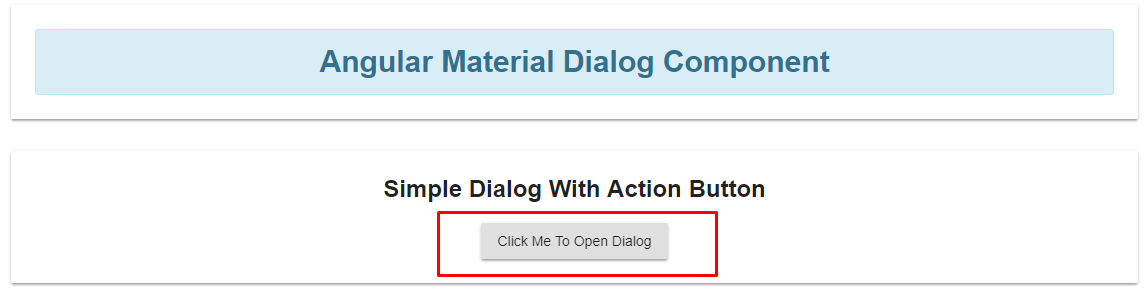
We have covered all the important steps to create and use the dialog component, now it’s time to call the dialog component on a button click from our app component.
App.component.html<mat-card> <div class="alert alert-info"> <strong>Angular Material Dialog Component</strong> </div> </mat-card> <mat-card> <h2>Simple Dialog With Action Button</h2> <button mat-raised-button (click)="dialog()">Click Me To Open Dialog</button> </mat-card>
In the above HTML code, simply we are calling the dialog () method which we have implemented into an app.component.ts file and once the user clicks on the button, the dialog component will be triggered and its layout will appear on the screen.
Step 6
Our last step is to execute the above example and see how it works. Run the Angular app by using the npm command npm start and the output will look like this.
1. When we run the example before clicking the event.
2. And when we click on the button, one at a time our dialog component will appear like this.
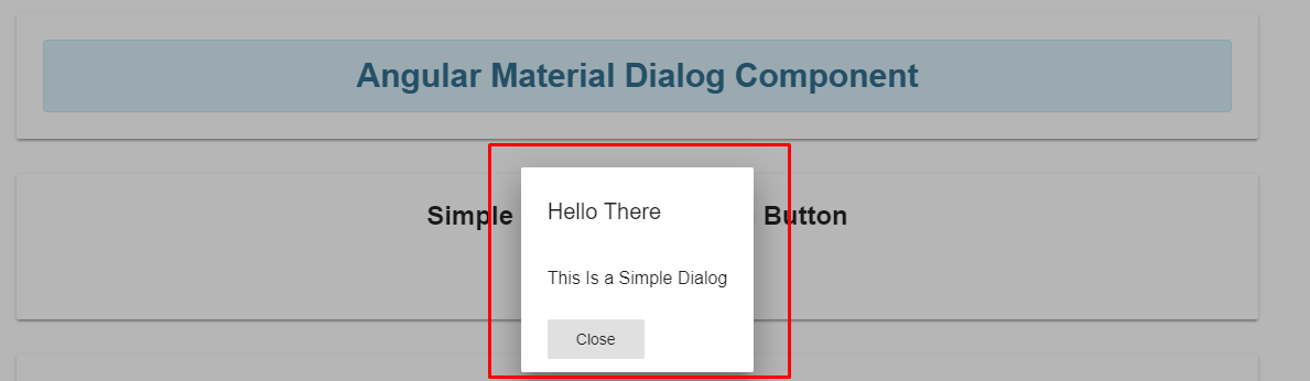
This is how we have implemented a simple dialog box as a reusable component and called from the root component to open a simple dialog box in action, Now it’s time to add more flavors by adding some form fields to see how dialog works with data.
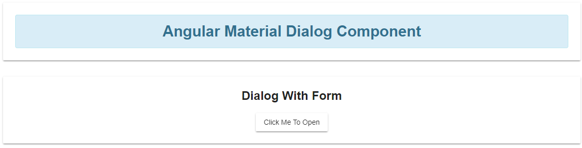
Dialog with Form
Angular Material's Dialogs with Forms feature enables developers to design interactive forms that are integrated into dialogs, collecting and analyzing data, and optimizing user experiences. Now everybody knows how to use a simple dialog component with our angular application because we have worked with the example where learned how to deal with the Angular material dialog component effectively,
In the upcoming example, we are going to use a form element along with submitting the form event and the dialog component will have the form in it. For that, you need to follow a few steps to achieve the same as described below.
Step 1
Our first and primary step is to create a component for dialog which contains code for a form with different form fields. For this example, I am going to ask for two different values from the user which are First name and last name from the user using a dialog box.
To work with the form elements, we have used an additional directive called mat-form-field that represents the input element as an individual form field.
Create a new component named dialogWithForm as given below.
dialogWithForm.component.tsimport { Component, Inject } from '@angular/core';
import { MatDialog, MatDialogRef, MAT_DIALOG_DATA } from '@angular/material';
export interface DialogData {
firstName: string;
lastName: string;
}
@Component({
template: `
<h1 mat-dialog-title>
Fill Basic Details
</h1>
<div mat-dialog-content>
<mat-form-field>
<input placeholder="First Name" matInput [(ngModel)]="data.firstName">
</mat-form-field><br>
<mat-form-field>
<input placeholder="Last Name" matInput [(ngModel)]="data.lastName">
</mat-form-field>
</div>
<div mat-dialog-actions>
<button mat-button [mat-dialog-close]="data">Submit</button>
<button mat-button (click)="onNoClick()">Close</button>
</div>
})
export class DialogWithFormComponent {
firstName: string = '';
lastName: string = '';
constructor(
public dialogRef: MatDialogRef<DialogWithFormComponent>,
@Inject(MAT_DIALOG_DATA) public data: DialogData) { }
onNoClick(): void {
this.dialogRef.close();
}
}
Let me clarify all the implemented things in the above source code. Imported related things like :
- Dialog reference: To get the reference of dialog to open and close it based on certain interactivity.
- MatDialog: A class, which is used to work with a dialog component.
- MAT_DIALOG_DATA: It is the very important part that is used to get the data from the dialog component and can pass it to another component.
If you observe the constructor, where I have used the reference of dialog to close the dialog box, and also used @inject, it means that whenever the user fills the form data inside the dialog box with the form data, it will be injected and data will be forwarded to the calling component and in our case, that component is DialogWithFormComponent.
Step 2
The next step is to add our form component into the app module as well as in the entryComponents configuration array as given below.
App.module.tsImport it like this inside the module file.
import { DialogWithFormComponent } from './dialog-component/dialogWithForm.component';
Then add it to two different arrays, the first one is inside the declaration [ ] array and then the entryComponents [ ] array.
declarations: [
 AppComponent,
 DialogWithFormComponent,
 ],
entryComponents: [
 DialogWithFormComponent,
 ],
The code registers DialogWithFormComponent in entryComponents for dynamic loading as a dialogue and declares it, allowing its use in the program.
Step 3
Now let’s open the model from our root component and enter the form data presented inside the dialog with form controls.
App.component.html<mat-card>
<div class="alert alert-info">
<strong>Angular Material Dialog Component</strong>
</div>
</mat-card>
<mat-card>
<h2>Dialog With Form</h2>
<button mat-raised-button (click)="dialogForm()">Click Me To Open</button>
<br>
<ng-template [ngIf]="firstName && lastName">
<h2>First Name IS : {{ firstName }}</h2>
<h2>Last Name IS : {{ lastName }}</h2>
</ng-template>
</mat-card>
The code creates a UI using Material cards, which include a title card, a card to open a dialogue box, and a card that conditionally displays the user's first and last names that are taken from the dialogue box.
App.component.ts
import { Component, OnInit } from '@angular/core';
import { MatDialog, MatDialogRef, MAT_DIALOG_DATA, MatDialogConfig } from '@angular/material';
import { DialogWithFormComponent } from './dialogWithForm.component';

@Component({
 selector: 'app-dialog-component',
 templateUrl: './dialog-component.component.html',
 styleUrls: ['./dialog-component.component.css']
})
export class DialogComponentComponent implements OnInit {

 firstName: string;
 lastName: string;
 dialogConfig: MatDialogConfig;
 dialogWithForm: MatDialogRef<DialogWithFormComponent>;

 constructor(private dialogModel: MatDialog) { }

 ngOnInit() {
 }

 dialogForm() {

 // Opening the dialog component
 const dialogWithForm = this.dialogModel.open(DialogWithFormComponent, {
 width: '250px',
 data: { firstName: this.firstName, lastName: this.lastName }
 });

 // When user close the dialog
 dialogWithForm.afterClosed().subscribe(result => {
 console.log('You have closed the dialog');
 if (result) {
 this.firstName = result.firstName;
 this.lastName = result.lastName;
 }
 });
 }

}
Let’s break down all the functionality we have implemented into the above source code.
- Imported our dialog component which contains the form along with the dialog component configurations
- Declared two different variables for the form elements as first name and last name to hold form values and print them inside our app component output
- Inside the dialog Form() method :
- Going to open a dialog box with the data parameter which holds the value of two variables that we have declared previously for the first name and the last name
- When the user closes the dialog, at a time after close() event will be triggered and we will get the data into two variables in the form of a result
Step 4
So far, we have implemented all the things that we intended to develop, the next step is to execute the above example and see the action. When you run the example, it will look like this.
Click on the button and see the dialog that appears like this.
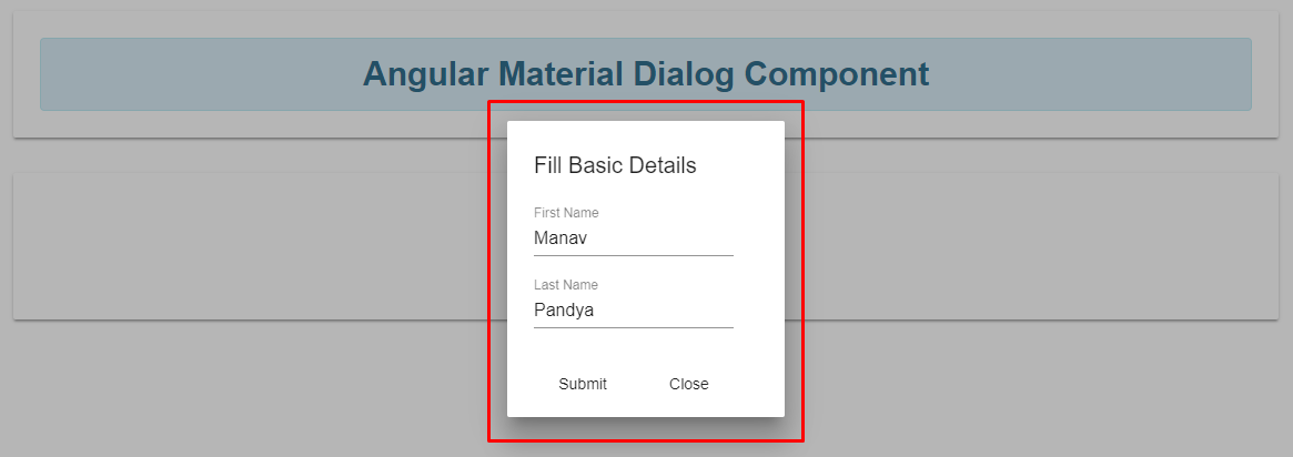
Just provide the different values for first name and last name, then click on the submit button, it will close the dialog and we will have both values like this.
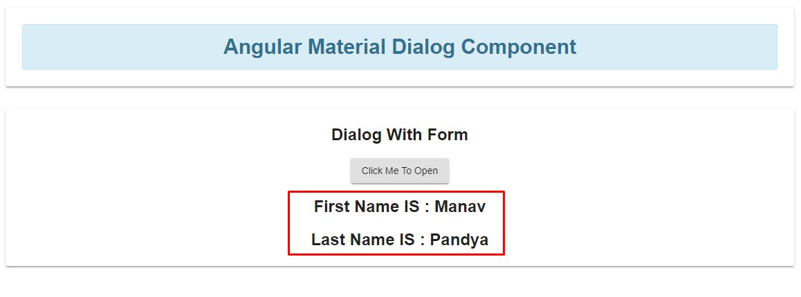
As you can see in the above image we got the two different values added by us inside a model dialog and in output we have values that come from the dialog component. This is how we can implement a form with different form fields, you can expand it by using different form fields like radio buttons, dropdowns, and file uploads.
Summary
The Dialogue component of Angular Material improves user interaction and input. This tutorial looked at constructing and using dialogues, both basic and using forms. Module import, component configuration, dialogue opening, data management, and result display were all covered. Once you've mastered these methods, you can incorporate strong dialogues into your Angular applications.
FAQs
Q1. How to use material dialog in Angular?
Calling the open method with a component to load and an optional configuration object opens a dialogue box. Let dialogRef = dialog.open(UserProfileComponent, { height: '400px', width: '600px', }); The MatDialogRef offers a handle on the opened dialogue. The open method will return an instance of MatDialogRef.
Q2. What is a dialog component?
A dialogue is a type of modal window that shows up in front of the app's content and asks the user to choose or provide important information. Dialogues come on the screen and remain there until they are dismissed, confirmed, or a necessary action is made. When they do, all app functionality is disabled.
Q3. How to pass data to MatDialog?
Any type of data can be added to the MatDialog's open() options and passed to the component. }, }); By injecting MAT_DIALOG_DATA into the component that has been opened, you can get the data back.
Q4. Why use the material in angular?
Angular Material provides us with a comprehensive range of interface elements that are accessible and support multiple languages when we utilize them in our projects.
Q5. How to open a dialog in angular?
By using the open method with a component or a TemplateRef that represents the dialog's content, you can start a dialogue. Furthermore, an optional configuration object is accepted by the method. An instance of DialogRef is returned by the open method: dialogRef const = dialog.
Take our free skill tests to evaluate your skill!

In less than 5 minutes, with our skill test, you can identify your knowledge gaps and strengths.
