
Understanding Angular Material Grid Layout

Angular Course
Angular Material Grid Layout: An Overview
In the Angular material tutorial, we do have a grid layout system similar to the bootstrap grid that is used to create the two-dimensional list view. In the Angular material library, we have a grid list module which is useful to create e the grid layout in our angular.While Angular Material's grid architecture offers responsiveness across laptops, tablets, & mobile devices, deploying it takes some initial setup within your project. This entails installing the required modules and customizing themes. The main advantage of utilizing the Material grid is that it adjusts automatically based on screen resolution, ensuring a uniform layout regardless of device.
What is Angular Material Grid?
Angular Material Grid is a built-in component for constructing responsive, grid-based layouts in your Angular projects. It has adaptable columns, adjusts to multiple screen sizes (laptops, tablets, and smartphones), and manages visual alterations automatically, guaranteeing a consistent layout across platforms.
Types of the material grid elements
We will use the different elements to create a material grid in our angular application which is listed below.
Mat-grid-list
Mat-grid-tile
Mat-grid-tile-header
Mat-grid-tile-footer
1. Mat-grid-list
The basic component of the Angular Material Grid that builds the actual grid structure is the mat-grid list. It specifies the number of columns & arranges content cells (tiles) into a visually pleasing, responsive grid.
Syntax
 <mat-grid-list>
 </mat-grid-list>
Properties
- Cols: Specifies the number of columns to be generated.
- gutterSize: Defines the size of the grid list’s gutter in the form of pixels, and always the default value will be 1px. And we can also specify the ratio or rem(root em) value with it.
- rowHeight: It specifies the height of the grid list.
Example: Module file:
import {MatGridListModule} from '@angular/material/grid-list';
This code imports the MatGridListModule from the Angular Material library, allowing you to use grid list components in your Angular application.
Html file:
 <mat-grid-list cols="4" [style.background]="'skyblue'">
 <mat-grid-tile>Tile 1 </mat-grid-tile>
 <mat-grid-tile>Tile 2 </mat-grid-tile>
 <mat-grid-tile>Tile 3 </mat-grid-tile>
 <mat-grid-tile>Tile 4 </mat-grid-tile>
 </mat-grid-list>
This code generates a grid list with four columns, a sky-blue background, and four tiles organized in a grid.
Output
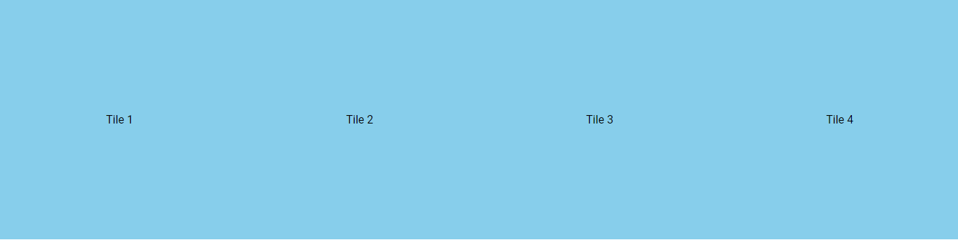
As you can see it will create a grid with a list of 4 columns with almost 100px height because we do not provide any specific value, thus it will take the default height automatically.
We can use a few important properties as described above with a material grid to have a more manageable grid for our single-page application.
To implement those properties, we can try the example below for more and a better understanding. Open the HTML file and try the given code snippet.
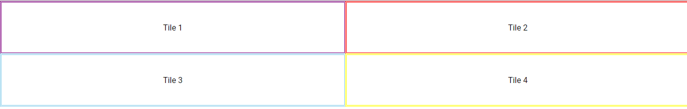
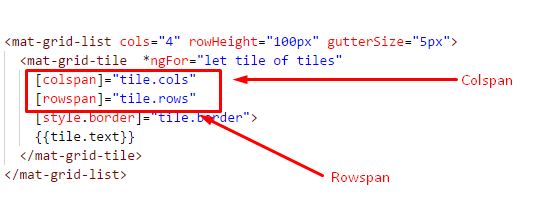
 <mat-grid-list cols="4" rowHeight="100px" gutterSize="5px"
 <mat-grid-tile *ngFor="let tile of tiles"
 [colspan]="tile.cols"
 [rowspan]="tile.rows"
 [style.border]="tile.border">
 {{tile.text}}
 </mat-grid-tile>
 </mat-grid-list>
This code creates a grid list with four columns, a row height of 100 pixels, a tile spacing of 5 pixels, & dynamically generates tiles based on data in the "tiles" array, allowing for tiles to span several rows or columns and have configurable borders. To specify the basic settings for the grid and for the tile specifically, we need to provide appropriate properties to render the grid element as per our different functional requirements.
Component file
import { Component } from '@angular/core';

export interface Tile {
 cols: number;
 rows: number;
 text: string;
 border: string;
}

@Component({
 selector: 'app-root',
 templateUrl: './app.component.html',
 styleUrls: ['./app.component.css']
})
export class AppComponent {

 tiles: Tile[] = [
 {text: 'Tile 1', cols: 2, rows: 1 ,border: '3px double purple'},
 {text: 'Tile 2', cols: 2, rows: 1 ,border: '3px double red'},
 {text: 'Tile 3', cols: 2, rows: 1 ,border: '3px double skyblue'},
 {text: 'Tile 4', cols: 2, rows: 1 ,border: '3px double yellow'},
 ];
}
This code defines the AppComponent class, which creates an array of tile data for use in the accompanying HTML template's dynamic grid generation. Each tile object has its own text content, size (columns and rows), and border style.
Output
2. Mat-grid-tile
Mat-grid-tile represents individual cells in an Angular Material grid, which serve as containers for the content displayed within each grid unit. It enables for size, stretches across several rows or columns, and stylistic customization.
Syntax
<mat-grid-tile>
</mat-grid-tile>
Properties
- Rowspan: The total amount of rows at the time the grid takes
- Colspan: The total amount of columns at the time the grid takes
Example
We already did the same thing in the above example; you can see that I have specified rowspan and colspan as primary properties so that it will get appropriate space into the specific cell. In short, we are giving more space to each of the tiles by providing rowspan and colspan properties; you can find the difference like this.
3. Mat-grid-tile-header
Mat-grid-tile-header is a component that adds a header section to a specified grid tile, allowing additional information or labels to be displayed above the main content within a tile.
Syntax
We need to include the given selector in the HTML file with the element we want to use with it.
 <mat-grid-tile-header>
 </mat-grid-tile-header>
Example
Open your HTML file and replace the following code snippet.
<mat-grid-list cols="4" rowHeight="170px" gutterSize="5px">
<mat-grid-tile *ngFor="let tile of tiles"
[colspan]="tile.cols"
[rowspan]="tile.rows"
[style.border]="tile.border">
<img src="./assets/Dotnettricks.png">
<mat-grid-tile-header>
<h3>{{tile.text}}</h3>
</mat-grid-tile-heade>
</mat-grid-tile>
</mat-grid-list>
This code generates a grid with four columns, a row height of 170 pixels, a spacing of 5 pixels, and tiles dynamically generated from the "tiles" array. Each tile includes an image, a text header, and the ability to span many rows/columns with custom borders.
Output

4. Mat-grid-tile-footer
Mat-grid-tile-footer is an Angular Material component that adds a footer section to a grid tile, allowing supplemental content or actions to be placed below the main content within a tile.
Syntax
 <mat-grid-tile-footer>
 </mat-grid-tile-footer>
Example
<mat-grid-list cols="4" rowHeight="170px" gutterSize="5px">
<mat-grid-tile *ngFor="let tile of tiles"
[colspan]="tile.cols"
[rowspan]="tile.rows"
[style.border]="tile.border">
<img src="./assets/Dotnettricks.png">
<mat-grid-tile-footer>
<h3>{{tile.text}}</h3>
</mat-grid-tile-footer>
</mat-grid-tile>
</mat-grid-list>
This code generates a four-column grid with 170px tiles, 5px spacing, and dynamic tiles drawn from an array. Each tile contains an image, and a text footer, can span numerous rows/columns, and has custom borders.
Output

At the bottom you can see that the number of tiles is rendered with the image we have used with it, So this is how we can use the header and footer with our material grid list.
So at last by combining it we will have a complete grid with tiles and the header and footer part developed, let’s see the expanded example with it.
Example
 <mat-grid-list cols="4" rowHeight="170px" gutterSize="5px">
 <mat-grid-tile *ngFor="let tile of tiles"
 [colspan]="tile.cols"
 [rowspan]="tile.rows"
 [style.border]="tile.border">
 <img src="./assets/Dotnettricks.png">

 <mat-grid-tile-header>
 <h3>{{tile.text}}</h3>
 </mat-grid-tile-header>

 <mat-grid-tile-footer>
 <h3>{{tile.text}} </h3>
 </mat-grid-tile-footer>

 </mat-grid-tile>
 </mat-grid-list>
This code generates a four-column grid with 170px tiles, 5px spacing, and dynamic tiles drawn from an array. Each tile contains an image, a text footer, can span numerous rows/columns, and has custom borders.
Output

Summary
Angular Material Grid provides responsive layouts across devices, although initial configuration is required. Mat-grid-list (grid structure), mat-grid-tile (individual cells), mat-grid-tile-header (adds header), and mat-grid-tile-footer (adds footer) are its major components. These elements, when combined with customization attributes such as cols, rowspan, and borders, let you to create dynamic and visually appealing grids for your Angular apps.
 Previous Tutorial