 Previous Tutorial


25
AprAngular Material Toolbar
02 Aug 2022
Intermediate
23K Views
11 min read

Learn via Video Course & by Doing Hands-on Labs
Angular Course
The toolbar is one of the important parts of many web applications which allows the user to navigate from one page to another; we have a separate component in the angular material to integrate with the angular application. The main use of the toolbar is to show the application title and a few different options like the material menu and other buttons.
The Material toolbar components are designed to add the wrapper that may contain other items such as the header section, titles of the application, or actions. We can use various components of the material toolbar module such as <mat-toolbar> and <mat-toolbar-row> to create and structure the various toolbars for our Angular application to served the different toolbar purposes.
In this article of angular material tutorial series, we will try different layouts using the toolbar components, so that you get to know the different ways to use the toolbar in your angular application. For that create a new angular project and install angular material, you can follow my previous articles for that.
How to include Toolbar
To use the toolbar in our angular app, we need to import the toolbar module called MatToolbarModule into the root module as described below.
App.module.ts
import { BrowserModule } from '@angular/platform-browser';
import { NgModule } from '@angular/core';
import { FormsModule, ReactiveFormsModule } from '@angular/forms';
import { AppComponent } from './app.component';
// To use Animations
import { BrowserAnimationsModule } from '@angular/platform-browser/animations';
import { MatCardModule } from '@angular/material';
import { MatToolbarModule } from '@angular/material';

@NgModule({
 declarations: [
 AppComponent,
 ],
 imports: [
 BrowserModule,
 FormsModule,
 BrowserAnimationsModule,
 MatCardModule,
 MatToolbarModule
 ],
 exports: [
 BrowserModule,
 ],
 providers: [],
 bootstrap: [AppComponent]
})
export class AppModule { }
As you can see that first, we have imported the Material toolbar module and which is included inside the import array, now we will be able to use the toolbar module in our angular application.
Basic Toolbar
To include a basic toolbar component in our angular application, we need to use a simple markup tag or directive <mat-toolbar> as described below.
Syntax
 <mat-toolbar>
 </mat-toolbar>
Example
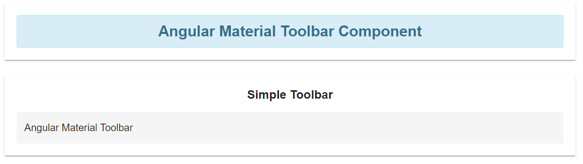
App.component.html<mat-card> <div class="alert alert-info"> <strong>Angular Material Toolbar Component</strong> </div> </mat-card> <mat-card> <h2>Simple Toolbar</h2> <mat-toolbar>Angular Material Toolbar</mat-toolbar> </mat-card>
In the above source code example, I have used different material components as mentioned below.
<mat-card>
To show some informative elements such as title and to hold the toolbar inside the card component
<mat-toolbar>
To show a simple toolbar with some static text. We don’t have any menu or buttons within the toolbar, it’s just a simple toolbar, but we can enhance it as per our requirements. Now try to run the above example and you can see output like this.
Output
Multi-Row Toolbar
We have seen the simple toolbar with the single row without any other elements, but we can also have a Toolbar with multiple rows so that we can have multiple options to select from the toolbars. For that, we can have an additional markup to show different rows within the single toolbar and it can be possible using <mat-toolbar-row> to divide the toolbar into multiple rows.
Syntax
 <mat-toolbar>
 <mat-toolbar-row>
 <!-- Toolbar content -->
 </mat-toolbar-row>
 <mat-toolbar-row>
 <!-- Another Toolbar content -->
 </mat-toolbar-row>
</mat-toolbar>
We have used the new markup tag <mat-toolbar-row>, which is used to add a new row to the toolbar, let’s see a simple example for that.
Example
App.component.ts<mat-card> <div class="alert alert-info"> <strong>Angular Material Toolbar Component</strong> </div> </mat-card> <mat-card> <h2>Toolbar With Multiple Rows</h2> <mat-toolbar> <mat-toolbar-row> <h3>This is toolbar 1</h3> </mat-toolbar-row> <mat-toolbar-row> <h3>This is toolbar 2</h3> </mat-toolbar-row> <mat-toolbar-row> <h3>This is toolbar 3</h3> </mat-toolbar-row> </mat-toolbar> </mat-card>
Here in this example, I have created three different rows inside the primary Toolbar component, and when we run the above example of the multiple rows with the toolbar, the output may look like as given below.
Output
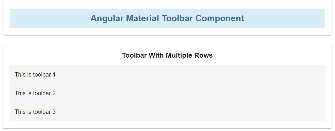
Now we have multiple rows within a single material toolbar something like the above image.
Rows with Icons
In the previous example, we have learned how to use multiple rows with Toolbar, In the same way, if we want to use icons related to toolbar title then we can use material icons along with toolbar rows.
The purpose of using icons with the toolbar or other element is to notify the user to identify the type of action being taken if they follow the content, for example, the cart icon shows cart where the products can be stored, so it will be easy for the end-user to redirect using the visual element rather than the normal text.
But before using icons we need to add a style sheet for material icons in the index.html file.
/src/index.html<!doctype html> <html lang="en"> <head> <meta charset="utf-8"> <title>Angularmaterialcomponents</title> <base href="/"> <meta name="viewport" content="width=device-width, initial-scale=1"> <link rel="icon" type="image/x-icon" href="favicon.ico"> <!-- To use material icons --> <link href="https://fonts.googleapis.com/icon?family=Material+Icons" rel="stylesheet"> </head> <body> <app-root></app-root> </body> </html>
Now we have added a stylesheet link to our app, and then we can use tons of material icons into our angular application, to add icons, we need to use a markup tag like this.
Syntax
 <mat-icon>
 // icon name
 </mat-icon>
Do not forget to import the material icon module into the app.module as described below.
App.module.tsimport { BrowserModule } from '@angular/platform-browser';
import { NgModule } from '@angular/core';
import { FormsModule, ReactiveFormsModule } from '@angular/forms';
import { AppComponent } from './app.component';
// To use Animations
import { BrowserAnimationsModule } from '@angular/platform-browser/animations';
import { MatCardModule } from '@angular/material';
import { MatToolbarModule } from '@angular/material';
import { MatIconModule } from '@angular/material/icon';
@NgModule({
declarations: [
AppComponent,
],
imports: [
BrowserModule,
FormsModule,
BrowserAnimationsModule,
MatCardModule,
MatToolbarModule,
MatIconModule
],
exports: [
BrowserModule,
],
providers: [],
bootstrap: [AppComponent]
})
export class AppModule { }
Example
App.component.html<mat-card> <div class="alert alert-info"> <strong>Angular Material Toolbar Component</strong> </div> </mat-card> <mat-card> <h2>Toolbar With Multiple Rows and Icons</h2> <mat-toolbar> <mat-toolbar-row> <h3>This is toolbar 1</h3> <mat-icon>shopping_cart</mat-icon> </mat-toolbar-row> <mat-toolbar-row> <h3>This is toolbar 2</h3> <mat-icon>supervisor_account</mat-icon> </mat-toolbar-row> <mat-toolbar-row> <h3>This is toolbar 3</h3> <mat-icon>videocam</mat-icon> </mat-toolbar-row> </mat-toolbar> </mat-card>
In this example, I have used multiple rows with a single toolbar and also added different material icons like Shopping cart, supervisor account, and videocam. Now run the above example, and see how it actually works.
Output
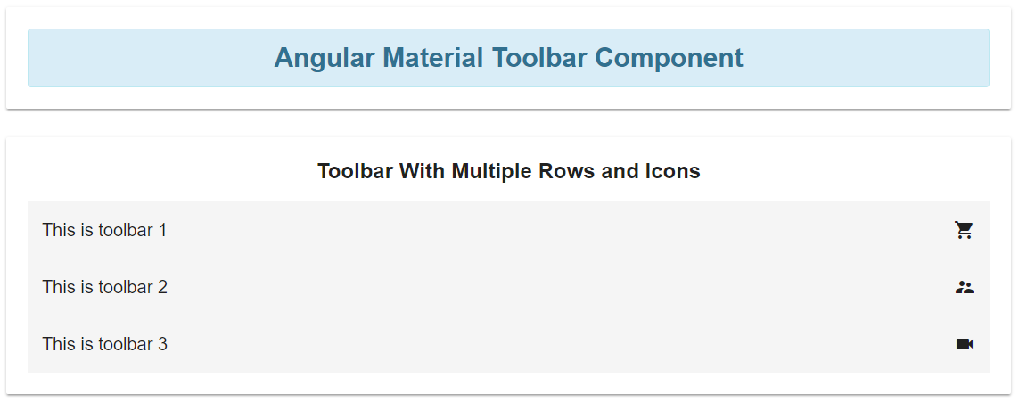
As you can see in the above image that along with each toolbar row, I have different material icons attached, so this is the way you can try including icons to get the batter information about the toolbar and other options.
Toolbar with Menu
So far we have tried Toolbar with a single row, multiple rows, and with icons as well, but it will be awesome if we can use the menu with the toolbar, yes we can also use and implement Menu with the toolbar. In order to use the menu with the toolbar, we need to import the toolbar module in our root app module file like this.
App.module.tsimport { BrowserModule } from '@angular/platform-browser';
import { NgModule } from '@angular/core';
import { FormsModule, ReactiveFormsModule } from '@angular/forms';
import { AppComponent } from './app.component';
// To use Animations
import { BrowserAnimationsModule } from '@angular/platform-browser/animations';
import { MatCardModule, MatButtonModule } from '@angular/material';
import { MatToolbarModule } from '@angular/material';
import { MatIconModule } from '@angular/material/icon';
@NgModule({
declarations: [
AppComponent,
],
imports: [
BrowserModule,
FormsModule,
BrowserAnimationsModule,
MatCardModule,
MatToolbarModule,
MatIconModule,
MatButtonModule
],
exports: [
BrowserModule,
],
providers: [],
bootstrap: [AppComponent]
})
export class AppModule { }
In this module file, we have imported other material components like the menu module, icon module, and button module to use the menu with the toolbar module. Now let’s design our Toolbar with the menu, for that open the app.component.html file and paste the following code.
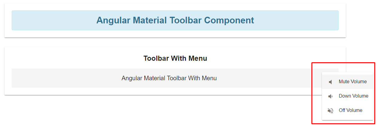
App.component.html<mat-card> <div class="alert alert-info"> <strong>Angular Material Toolbar Component</strong> </div> </mat-card> <mat-card> <h2>Toolbar With Menu</h2> <mat-toolbar> <h3 class="custom-space">Angular Material Toolbar With Menu</h3> <button mat-icon-button [matMenuTriggerFor]="menu"> <mat-icon>more_vert</mat-icon> </button> <mat-menu #menu="matMenu"> <button mat-menu-item> <mat-icon>volume_mute</mat-icon> <span>Mute Volume</span> </button> <button mat-menu-item> <mat-icon>volume_down</mat-icon> <span>Down Volume</span> </button> <button mat-menu-item> <mat-icon>volume_off</mat-icon> <span>Off Volume</span> </button> </mat-menu> </mat-toolbar> </mat-card>
Here, in this example, I have included a button and on the click of button element, there will be a menu window that will be popped up and can see the different menu items defined by mat-menu-item. Now run the above example and see what it looks like.
Output
This is how we have used the menu element within the toolbar component, thus we can implement many such components to make the toolbar more expandable or usable as per the layout requirements like we can include different links, buttons, and other HTML elements.
Summary
The <mat-toolbar> is a container component for headers, titles, or actions. In Angular material, the toolbar is placed at the header section of the application that can include the other elements as title or some other action elements in the specific section of an application.
The toolbar component can be any of the variants such as single row or multiple rows, depending on the layout requirement. Creating the toolbar with a single row can be integrated with <mat-toolbar> and </mat-toolbar> tags. For creating the toolbar with multiple rows, we can use the directive as <mat-toolbar-row> elements within the <mat-toolbar> material component.
In this part of the Angular Material series, we have learned about how to use toolbars with different options.
Basic Toolbar module introduction
Use multiple toolbar rows within the single material toolbar component
Toolbars with material icons
Toolbars with menu
But I would recommend you to go through all the above examples can create different toolbars so you will understand more, I hope you got an idea about how to implement the toolbar component with the angular application.