
VueJS Components : Nested Components, Props and Directives
Whenever we are developing a VueJS application we tend to break down the entire application into smaller parts, each part having a specific role and independent duties to serve a specific purpose.
Each of these smaller parts is called components and these very components come together like building blocks and give the application a complete form, and this way of creating components is also called re-usable or sharable components across the application.
Let’s take the example of a school building. What can we expect to have in a school building?
Now let’s see what all features and functionalities we can have in let’s say a social media web app built with VueJS?
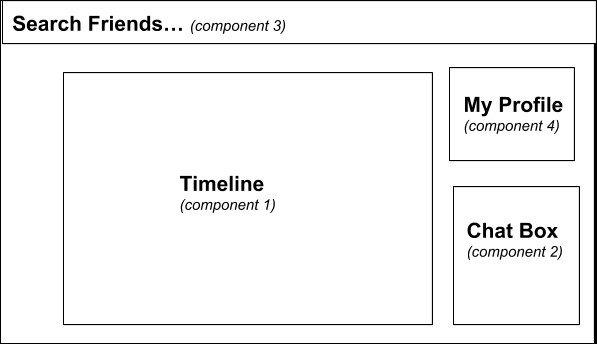
Now I am pretty sure the readers can relate the components in a VueJS web app with rooms in a building.
To make it more clear, I would like to add, just like the rooms in a building are allocated a specific role and each of the rooms are separate and independent, similarly, components are individual and independent and each of the components have a very specific task to accomplish.
And just like each of the rooms: the classroom, the library, and other rooms come together to give the form to the school building as a whole, similarly, the timeline component, the search friends component, and other components come together to give the social media web app a whole form.
Components:
Let’s understand the component structure by a hands-on approach: that is by building a small app with VueJS.
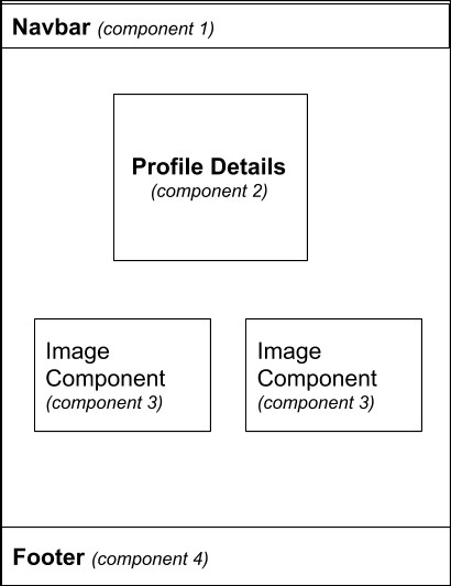
So what we will be making is a simple portfolio page by using the component structure by using other small child components and combining it creates a page.
A rough idea as of what we want to build:
In the previous article Getting-Started-With-Vue, it was discussed how to install the vue-cli.
So in this article let’s start by creating an app with the vue-cli, and below is the command that will create a new application called "my-portfolio".
> vue create my-portfolio
The above command will direct the vue-cli to create an app template by the name my-portfolio.
Once the app is created to run the second command to execute the application:
> vue run serve
This command will run the Vue app in port 8080 (default)
Now we have our my-portfolio app running locally in localhost:8080 URL.
There will be many folders created by the vue-cli by default but since we are at the very beginning of the course we will focus only on two main parts:
- The components folder
- The App.vue file
In the components folder, we will be creating all of our components in the App. vue we will be integrating aka importing all of our components and will be giving our app a form.
Initially, the localhost:8080 having the boilerplate code of the application will look something like this:
Step1: Remove the HelloWorld component from App.vue page
To get started with developing our web app we should first remove the default imported components from the App component so that we can create other new stuff.
After the component is removed a blank white error-free page should get loaded in the localhost:8080
Step2: Create a component Navbar in the components folder
So to create the navbar component, create the Navbar.vue file under the components folder as given below.
// Navbar.vue
<template>
 <div>
 <div class="topnav">
 <a class="active" href="#home">Home</a>
 <a href="#news">News</a>
 <a href="#contact">Contact</a>
 <a href="#about">About</a>
 </div>
 </div>
</template>

<script>
export default {
 name: 'Navbar',
 props: {
 }
}
</script>

<!-- Add "scoped" attribute to limit CSS to this component only -->
<style scoped>
.topnav {
 overflow: hidden;
 background-color: #333;
}

.topnav a {
 float: left;
 color: #f2f2f2;
 text-align: center;
 padding: 14px 16px;
 text-decoration: none;
 font-size: 17px;
}

.topnav a:hover {
 background-color: #ddd;
 color: black;
}

.topnav a.active {
 background-color: #4CAF50;
 color: white;
}
</style>
After the component is created it is to be imported in the App.vue file so that the Navbar re-usable component can be injected into the parent component.
After importing the App.vue file will look like this:
// App.vue
<template>
 <div id="app">
 <Navbar></Navbar>
 </div>
</template>

<script>
import Navbar from './components/Navbar.vue'

export default {
 name: 'app',
 components: {
 Navbar
 }
}
</script>

<style>
body {
 margin: 0;
 font-family: Arial, Helvetica, sans-serif;
}
</style>
After the import is complete you can see the Navbar in the localhost:8080.
Step3: Create other components just the way we created the Navbar component
So feel free to use your own HTML/CSS skills to develop the other 3 components:
The Profile Details component
The Image component
The Footer component
The profile details component: (Profile.vue)
// Profile.vue
<template>
 <div>
 <div class="card">
 <img src="http://allworldpm.com/wp-content/https://dotnettrickscloud.blob.core.windows.net/uploads/2016/10/230x230-avatar-dummy-profile-pic.jpg" alt="John" style="width:100%">
 <h1>John Doe</h1>
 <p class="title">Software Engineer, Google CA</p>
 <p>Harvard University</p>
 <div style="margin: 24px 0;">
 <a href="#"><i class="fa fa-dribbble"></i></a>
 <a href="#"><i class="fa fa-twitter"></i></a>
 <a href="#"><i class="fa fa-linkedin"></i></a>
 <a href="#"><i class="fa fa-facebook"></i></a>
 </div>
 <p><button>Contact</button></p>
 </div>
 </div>
</template>

<script>
export default {
 name: 'Profile',
 props: {
 }
}
</script>

<!-- Add "scoped" attribute to limit CSS to this component only -->
<style scoped>
.card {
 box-shadow: 0 4px 8px 0 rgba(0, 0, 0, 0.2);
 max-width: 300px;
 margin: auto;
 text-align: center;
 font-family: arial;
}

.title {
 color: grey;
 font-size: 18px;
}

button {
 border: none;
 outline: 0;
 display: inline-block;
 padding: 8px;
 color: white;
 background-color: #000;
 text-align: center;
 cursor: pointer;
 width: 100%;
 font-size: 18px;
}

a {
 text-decoration: none;
 font-size: 22px;
 color: black;
}

button:hover, a:hover {
 opacity: 0.7;
}
</style>
The Image component : (Image.vue)
// Image.vue
<template>
 <div>
 <img src="https://www.hassanlab.eu/sites/default/files/images/Paris.png" alt="Paris" width="300" height="300">
 </div>
</template>

<script>
export default {
 name: 'Image',
 props: {
 }
}
</script>

<!-- Add "scoped" attribute to limit CSS to this component only -->
<style scoped>
img {
 border-radius: 8px;
 margin: 20px;
 margin-bottom: 100px;
 float: left;
}
</style>
The Footer component: (Footer.vue)
Footer.vue
<template>
 <div>
 <div class="footer">
 <p>This is a demo footer. (c) 2018-19</p>
 </div>
 </div>
</template>

<script>
export default {
 name: 'Footer',
 props: {
 }
}
</script>

<!-- Add "scoped" attribute to limit CSS to this component only -->
<style scoped>
.footer {
 position: fixed;
 left: 0;
 bottom: 0;
 width: 100%;
 background-color: #333;
 color: white;
 text-align: center;
}
</style>
Step4: Integrate aka import all the components in App.vue
The next step after creating all the above components is to import them into the parent component App so that they can be consumed to create the complete page.
// App.vue
<template>
 <div id="app">
 <Navbar></Navbar>
 <div class="container">
 <Profile></Profile>
 <ImageComponent></ImageComponent>
 <ImageComponent></ImageComponent>
 <ImageComponent></ImageComponent>
 <ImageComponent></ImageComponent>

 </div>
 <Footer></Footer>
 </div>
</template>

<script>
import Navbar from './components/Navbar.vue'
import Footer from './components/Footer.vue'
import Profile from './components/Profile.vue'
import ImageComponent from './components/Image.vue'


export default {
 name: 'app',
 components: {
 Navbar,
 Footer,
 Profile,
 ImageComponent
 }
}
</script>

<style>
body {
 margin: 0;
 font-family: Arial, Helvetica, sans-serif;
}
.container {
 padding: 40px;
}
</style>
As you can see in the above component code, a total of four different components has been imported such as Navbar, Profile, ImageComponent, and the footer component, now all component can act as a child component of the App component.
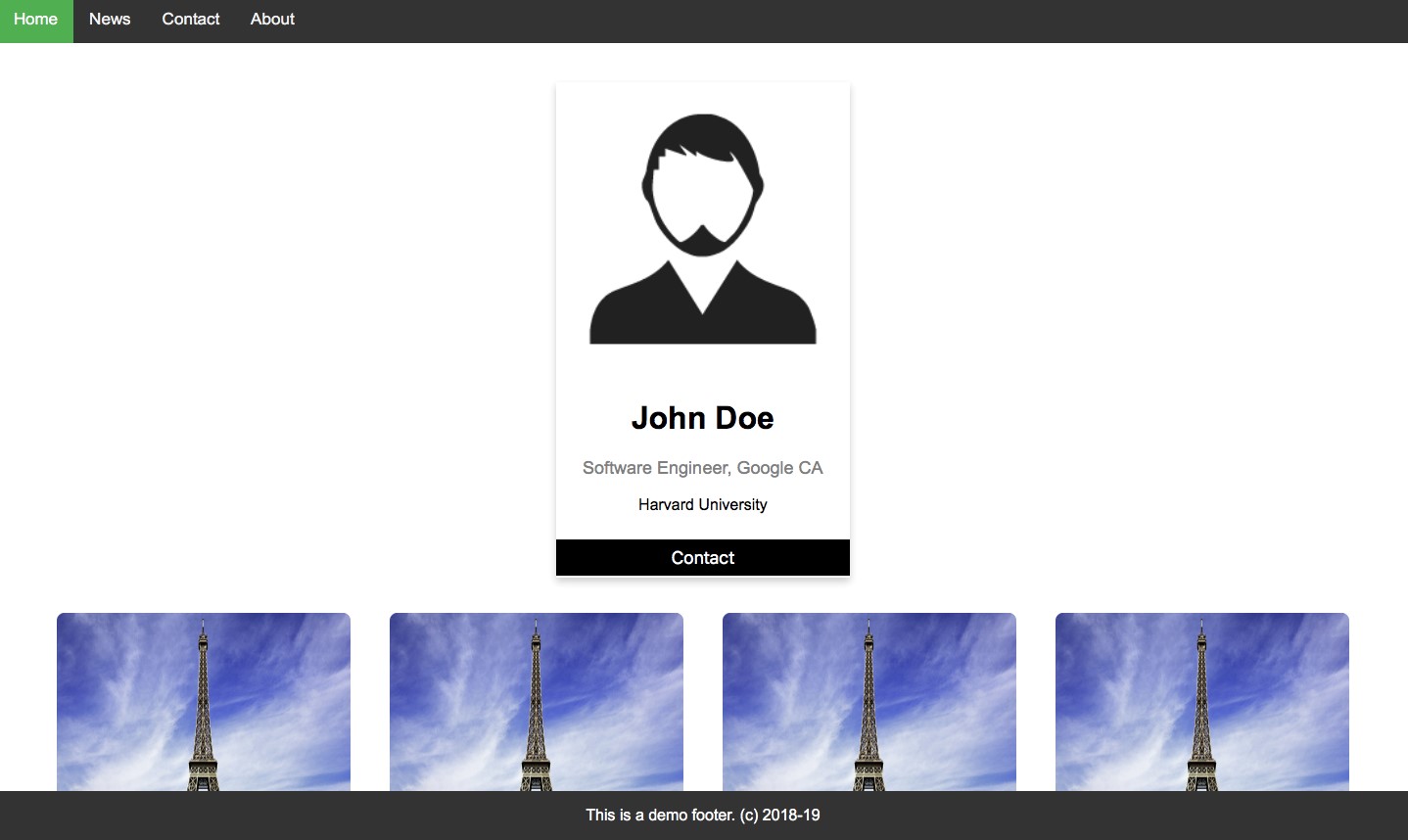
Once we are done creating and importing all the components as explained above, to see how the UI looks, we can run the Vue app again and the output may look like as given below.
PS: If my readers are wondering how to show different images in the same Image component and not show the same image in all the Image Components, then for that we need to use props to pass the image URL to each of the components. We will be discussing ‘props’ here as well.
Why do we need components?
Any reader who is new to VueJS or similar javascript frameworks like ReactJS or Angular might be confused as to why do we need to implement components in the first place?
Can’t we simply start building the app directly from the top of the page to the bottom of the page? Isn’t dividing a page into components and then again putting those components together with a more hectic task?
So let me start by throwing a problem.
Suppose you have a 20 paged website and you need a chat functionality (similar to the chat box component mentioned earlier) in 10 pages of those 20 paged websites. So if your chat functionality is not in a different independent component then you have to copy paste the codes related to your chat component in all the 10 pages again and again.
That will unnecessarily take up a huge amount of your time and will make the codebase messy and unclear.
Suppose you need the search feature in 6 of your pages and the profile feature in another 8 of your pages. Now just imagine the complexity that will arise if you keep on copy-pasting the codes to create features in pages.
So here comes the concept of components to rescue. How?
Now suppose you had the features separated as components. Then you simply had to import the components in each of the pages as and when required. Importing requires very minimal lines of extra coding and complexity and gives you zero code redundancy.
With components: write once, use everywhere.
To jot down everything, the main reasons we need components are:
Reusability: Components allow the developer to reuse the once made component again and again throughout the entire application without increasing the code complexity and keeping the codebase non-redundant.
By creating the re-usable components, we can achieve higher code readability as all the child components represent the part of the screen and work independently, by this way the page and the overall application structure behave in a robust way.
Maintainable and organized code: The component structure of a VueJS app allows the code to be cleaner and more maintainable as it reduces code redundancy. So if there is some bug in the search feature then the developer need not browse through all of the codebases but can simply work on the Search Component to find the bug.
Testing: When it comes to testing the web app, having a component structure helps a lot and every component can be unit tested effectively.
What are Props?
So in the previous example, we saw that we used the Image Component 4 times. But all the 4 had the same image.
So how to customize each component?
Here come ‘props’ to rescue. With props, you can send values to each component and customize them.
Through props, you can pass a number, a boolean, a string, an array, an object, or the properties of an object. These can be static or even dynamic. You can pass either one prop or multiple props to a single component.
One thing to ensure about the props is that they can not be manipulated to be altered during the lifecycle of the component, it's a read-only value that can only be consumed by the components.
Now let’s see an implementation of props:
So we modified the Image component and after some modifications, our Image.vue looks like this:
// Image.vue
<template>
 <div>
 <img :src=imageUrl width="300" height="300">
 </div>
</template>

<script>
export default {
 name: 'Image',
 props: {
 imageUrl: String,
 }
}
</script>

<!-- Add "scoped" attribute to limit CSS to this component only -->
<style scoped>
img {
 border-radius: 8px;
 margin: 20px;
 margin-bottom: 100px;
 float: left;
}
</style>
So what we changed is basically instead of giving a static URL in the img tag we replaced it with a dynamic value that we are receiving from the ‘props’.
For the same, we had to modify our App.vue template as well:
// App.vue
<template>
 <div id="app">
 <Navbar></Navbar>
 <div class="container">
 <Profile></Profile>
 <ImageComponent
 imageUrl="https://cdn-image.travelandleisure.com/sites/default/files/styles/1600x1000/public/1446842493/7-paris-social-niche1115.jpg?itok=H1i3qUcr">
 </ImageComponent>

 <ImageComponent
 imageUrl="https://www.airambulancecard.com/wp-content/https://dotnettrickscloud.blob.core.windows.net/uploads/2016/02/paris.jpg">
 </ImageComponent>
 <ImageComponent
 imageUrl="http://www.maierandmaierphotography.com/wp-content/https://dotnettrickscloud.blob.core.windows.net/uploads/2013/05/sacre-coeur-paris-france.jpg">
 </ImageComponent>
 <ImageComponent
 imageUrl="https://encrypted-tbn0.gstatic.com/images?q=tbn:ANd9GcQT4XQeqmbZGnq3XsbxICuGraLyPZzzHu3Z9jER5mADzzsO3I47">
 </ImageComponent>
 </div>
 <Footer></Footer>
 </div>
</template>
So now from App.vue, we are sending a different URL to each of the components as props so that each of the components is customized and dynamic because the unique props to the same component make it clear about what to be rendered accordingly.
And this would result in our web page having 4 different images and it would look something like:
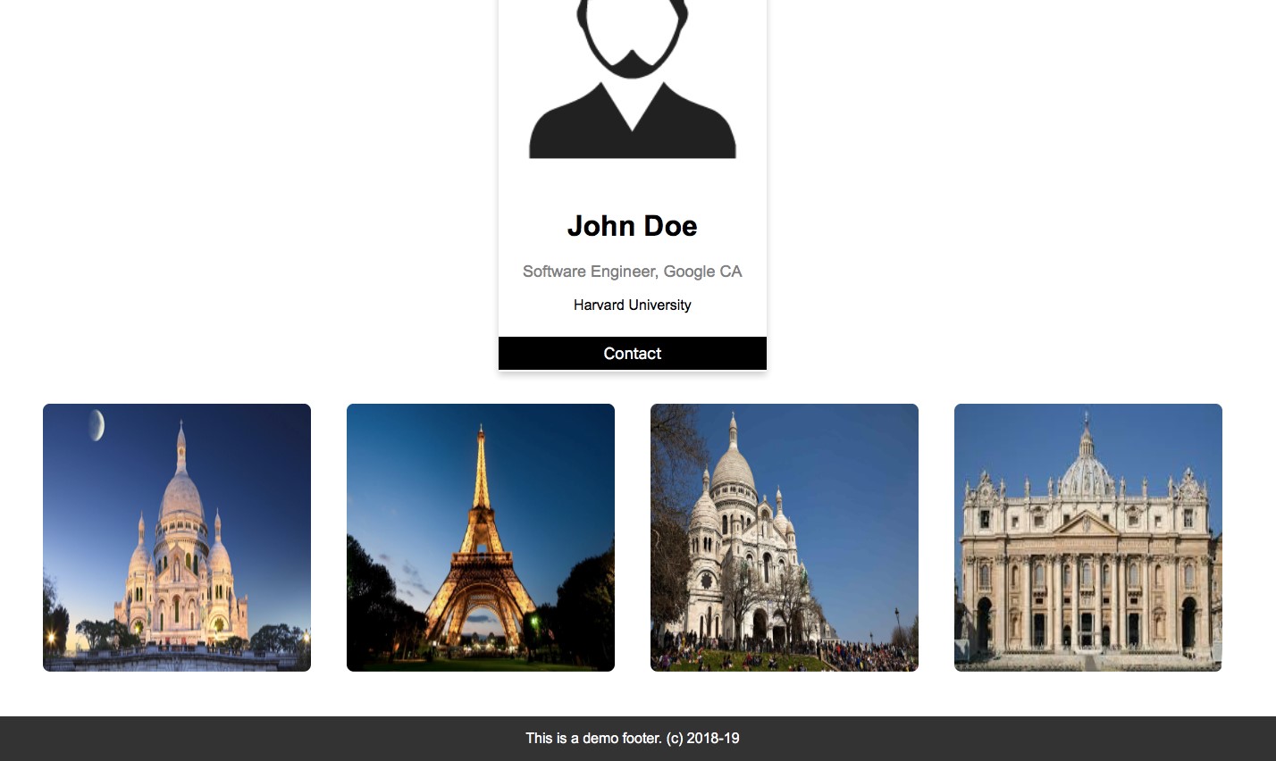
So after all these codings we have a web page built in VueJS and is divided into components that are customized by props!
Components vs Directives
So far we have discussed in detail what are components, why, and how should they be used in VueJS while building apps.
In this part, we would go through what are directives and how are directives different from components.
So directives basically integrate certain functionalities or behaviors to the components we have created or to already existing DOM elements.
A directive does not have its own view, unlike a component that has its own view.
So it comes down to the fact that when we create a component a view is created along with its associated behaviors.
But when a directive is defined, it just adds behaviors to components or to already existing DOM elements.
Let us now add some directives to our portfolio page that we have been building:
So we add the ‘v-on:click’ directive.
// Image.vue
<template>
 <div>
 <img :src=imageUrl v-on:click="showAlert" width="300" height="300">
 </div>
</template>
What happens here is basically when you click on on the Image Component from now on because of the v-on:click directive the method ‘showAlert’ will be called.
And we have defined the method in the following way inside the script tag:
// Image.vue
<script>
export default {
 name: 'Image',
 props: {
 imageUrl: String,
 },
 methods: {
 showAlert() {
 alert('Image is clicked');
 }
 }
}
</script>
From now on in our app whenever any of the images are clicked an alert is displayed.
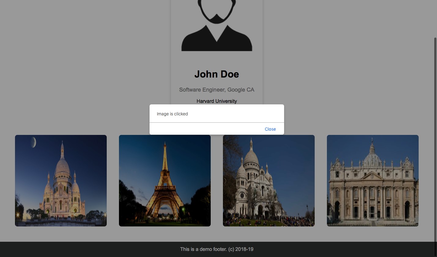
So the Image component is responsible for the view and the v-on:click is responsible for the associated behavior.
Nested Components
So what if now we want an ImageTag component inside every Image Component?
There comes the concept of Nested components.
In simpler words importing components inside components is called nesting of components as we have done already in this guide by importing re-usable components in the parent component.
Let’s get started with the coding of nested components in our already existing project.
Step1: Create the ImageTag component
Under the components, folder creates the file ImageTag.vue :
// ImageTag.vue
<template>
 <div>
 <p>This is image tag</p>
 </div>
</template>

<script>
export default {
 name: 'ImageTag',
 props: {
 }
}
</script>

<!-- Add "scoped" attribute to limit CSS to this component only -->
<style scoped>
p {
 text-align: center;
 font-family: 'Courier New', Courier, monospace;
 border: 1px solid burlywood;
 margin: 5px;
 padding: 5px;
}
</style>
The above code block will create the component ImageTag.
Step2: Import ImageTag component inside Image Component
Now simply import the ImageTag component inside the already existing Image Component.
// Image.vue
<template>
 <div class="image-container">
 <img :src=imageUrl v-on:click="showAlert" width="300" height="300">
 <ImageTag></ImageTag>
 </div>
</template>

<script>
import ImageTag from '../components/ImageTag.vue'

export default {
 name: 'Image',
 props: {
 imageUrl: String,
 },
 components: {
 ImageTag,
 },
 methods: {
 showAlert() {
 alert('Image is clicked');
 }
 }
}
</script>

<!-- Add "scoped" attribute to limit CSS to this component only -->
<style scoped>
img {
 border-radius: 8px;
 margin: 10px;
 /* margin-bottom: 100px; */
}
.image-container {
 float: left;
 margin-bottom: 100px;
}
</style>
That’s all.
Now you have the ImageTag component nested under the Image Component. This way we can have a multi-level child component or we can say the tree of the components where each child component represents the leaves.
And your page will now look somewhat like this:
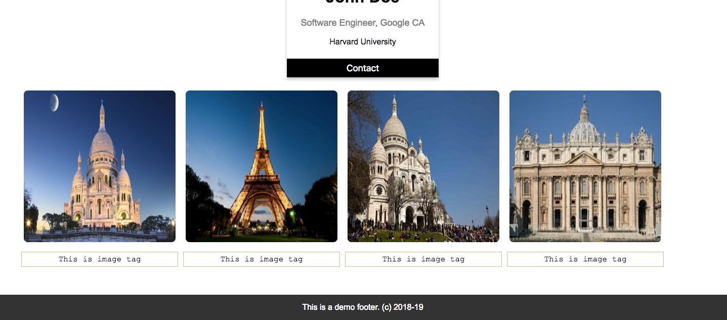
Now, in this case, the Image component is the parent component and the ImageTag is the child component.
The parent component and the child component can pass props and interact with each other.
Summary
I hope my readers have gained a deeper understanding of VueJS components after going through the article. So we build a VueJS app, that had a component structure and we passed props through it. Then we also explored the basics of VueJS directives and also created nested components.
My readers can try implementing props on nested components and customize each of the Image Tags as a takeaway assignment.
 Previous Tutorial


