
 Previous Tutorial


25
AprAngular Material Components : Divider and Expansion Panel
03 Aug 2022
Intermediate
12.5K Views
9 min read

Learn via Video Course & by Doing Hands-on Labs
Angular Course
In Angular Material, there are multiple components available, from them there is one component of two is Divider which is used to divide content as separation and another component is Expansion panel is used to expand the detailed summary about a single model item. Let’s cover two of the material component in a very detailed manner with appropriate examples.
Angular Material Divider Component
The divider component is used to separate lines with different orientations as per the element we want to separate. There are two types of possibility to separate lines like horizontally or vertically based on the layout we want, we should provide an additional setting parameter to the material divider component.
In order to use the material divider component in your Angular application, you can use the selector described below in a brief manner. Important is that if you want to use a divider component then you should import the divider component into a module as explained below.
Module file
import {MatDividerModule} from '@angular/material/divider';
After importing the material module, the next step is to import the module file, include MatDividerModule in the import and Export section respectively.
Syntax
To use a divider, we can use the mat-divider selector to include the line in between the text or any other element to add the divider element.
<mat-divider> … </mat-divider>Example
 <p>This is First Line</p>
 <mat-divider></mat-divider>
 <p>This is Second Line</p>
As you can see in the above example, that I have used two different lines of text and in between, I have included a divider, so when you run the above example you can see the output like this.
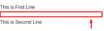
If you have noticed that a single line of the divider was included in between two lines, so this is how you can use a divider to place a line in between the elements or section to divide the content appropriately.
Material Divider properties
We have seen the simple divider example, but it also has two different properties which are given below.
Vertical divider
Inset divider
Vertical Divider
We have covered the basic divider example in which divider will be included horizontally, but if we want to use divider vertically then we can do using property vertical, and it's always a Boolean value.
Syntax
<mat-divider [vertical]="true/false" <… </mat-divider>
Inset Divider
It is the property for the divider, and it decides that whether the divider will be inset or not, and its value will always be the Boolean.
Syntax
<mat-divider [inset]="true/false" > … <mat-divider >Example
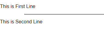
 <p>This is First Line</p>
 <mat-divider [inset]="true"></mat-divider>
 <p>This is Second Line</p>
Here in this example, I have used two different lines of text, with mat-divide and with the selector I have provided an additional property which is called inset when you run the above example, you will get the output like this.
So this is how we can use a divider with different properties, to understand more try the above-given examples.
Angular Material Expansion Panel
Material Expansion Panel component is used to show the detailed summary to the end user. Sometimes we have a different kind of information for a different topic like we have information for the personal information section, professional experience section, educational qualification information, etc, so to display the initial title for the subject and will display the detailed data by expanding it. In this kind of situation, we can make use of the expansion panel to show relevant information by expanding it as per the requirement, for that we have the selector in the angular material to implement the same into our angular single page application. Let’s cover the topic in a very detailed manner.
Angular Material Expansion Panel component will have an expandable details-summary layout with toggle operation where we can show or hide its internal content. we can use expansion panel using its multiple directives depending upon its usage such as using mat-accordion, mat-expansion-panel, mat-expansion-panel-header, etc element.
Syntax
There is a separate selector for expansion panel in angular material, for that we just need to include it in our application like the below syntax.
 <mat-expansion-panel>
 </mat-expansion-panel>
So this is the basic selector, by using this selector we can implement an expansion panel, but with an expansion panel, we should have an appropriate header and also may contain an action bar because by clicking on the expansion panel, we will be able to open the content section into the screen otherwise it may be hidden on load.
In order to work with the expansion panel, we should import MatExpansionModule into our module file just as explained below.
Module file
import {MatExpansionModule} from '@angular/material/expansion';
For that, we will learn different selector that makes the expansion panel more presentable in an easy manner, in order to implement we are going to use a collection of the selectors which are listed below.
Selector
Description
<mat-expansion-panel>
Used to implement expansion panel and its a container element of the expansion component
<mat-accordion>
By using accordion, we can group multiple expansion panels and it is very similar to the HTML5 accordion
<mat-expansion-panel-header>>
To provide a header to the expansion panel and also acts as a collapse and expand actions
<mat-panel-title>
Provides title to the expanding panel
<mat-panel-description>
It provides the description of the expanding panel or provides the content for the element
<mat-action-row>
If we want to have an action button then we can provide an action row with a panel
Now let’s cover every selector with the basic example, and at the end, we will cover all of the selectors within a single example.
<mat-expansion-panel>
This is the primary selector which is used to create an expansion panel; inside this selector, we will use all the other selectors to get the complete working expansion panel.
<mat-accordion>
The material accordion is used to group multiple expansion panels.
Syntax
<mat-accordion> … </mat-accordion>
<mat-expansion-panel-header>
<mat-panel-title>
This selector is used to provide the title to the expanding panel with an appropriate line of text or a status text.
Syntax
<mat-panel-title> … </mat-panel-title>
<mat-panel-description>
In order to provide the relevant information to the end user about the purpose of the panel, then we can use this selector to provide the description.
Syntax
<mat-panel-description> … </mat-panel-description>
<mat-action-row>
Sometimes we need to collapse the expansion panel using an action button, so for that, we can use this selection to have a separate action row within the panel.
Syntax
<mat-action-row> … </mat-action-row>
Here we have covered many selectors which are advisable to use with expansion panel to make expansion panel components well presentable, now let’s implement an example where we can see the actual usage of all these selectors with expansion panel.
Example<mat-accordion> <mat-expansion-panel> <mat-expansion-panel-header> <mat-panel-title>Panel Title </mat-panel-title> <mat-panel-description>Panel Description </mat-panel-description> </mat-expansion-panel-header> <p>Content Inside Expaned Panel</p> <mat-action-row> <button mat-button>Close</button> </mat-action-row> </mat-expansion-panel> </mat-accordion>
As you can see into above that I have used all the selectors that we have discussed previously, try to run the above example and you will get output like this.
Material expansion panel header selector is used to provide the header section to the panel which we are going to expand.
Syntax
<mat-expansion-panel-header> … </mat-expansion-panel-header>
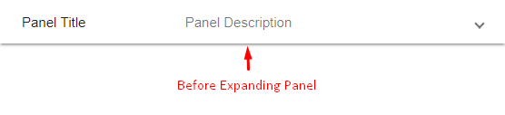
Before expanding panel
After expanding panel
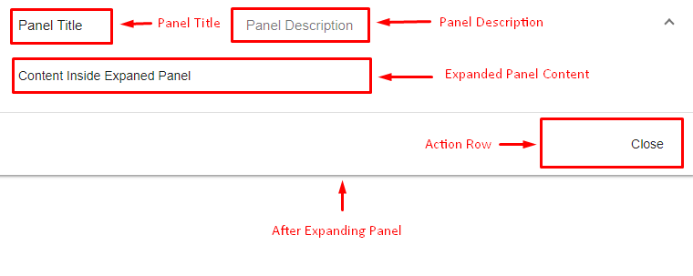
So you can see the difference by expanding and collapsing the expansion panel, this is how we have implemented the expansion panel with the all possible selectors, try to play around with the code we have covered, and create a presentable expansion panel by yourself.
Summary
So, in this part of the series getting started with angular material, we have covered two component which is the Divider component and Expansion panel, as per the situation we can make use of the divider and expansion components to make our single page app presentable, to understand it properly I would suggest you do some self exercise with above-explained examples and learn to create something extraordinary from it, Keep working then.