
 Previous Tutorial


25
AprAngular Material Card Component
23 Dec 2023
Intermediate
64.8K Views
11 min read

Learn via Video Course & by Doing Hands-on Labs
Angular Course
Angular Material Card Component: An Overview
A card component is a kind of container that contains different elements like text, images, forms, maps, buttons, links, and any other elements. As per the official documentation, Angular Material Card Component is a container component that holds title text, image, and action buttons to represent a single or specific subject.The <mat-card> element is responsible for implementing the card component of the Angular Material and it is a container for the content that can be used to insert the various elements such as media files, text & action buttons in context to the single subject. The basic need for designing the card component is only an <mat-card> element that has some child content in it, that will be used to build simple card components.
Card Component
The Card Component can be useful in a scenario where we want to show data about a single model with all its properties. A card component follows the structure in which different elements can be implemented based on the region defined inside the card; let’s see the basic syntax of the card components.
Syntax
 <mat-card>
 </mat-card>
Above is the selector of the material card component, and it is used to implement the card component into our angular HTML templates, moreover, we can have a specific structure of the card such as header, content, and footer section to structure the overall card component.
Example
 <mat-card>
 <mat-card-header>
 This is card Header
 </mat-card-header>
 <mat-card-content>
 This is card Content
 </mat-card-content>
 <mat-card-footer>
 This is card Footer
 </mat-card-footer>
 </mat-card>
As you can see in the above example the body of the card is distributed into three different child sections.
- mat-card-header: To represent the header section of the card component
- mat-card-content: To show the card content and it can be any element
- mat-card-footer: To show the card footer content
Let’s cover all the possible ways to use card components.
Simple Card
If we just want to show card elements on our page, then we can have a simple card component without having extra selectors like a header, and footer and it can be used as it is.
Generally, the simple card component can be used to show a single image, iframe, defining a menu, and showing textual content hence, no child elements will be required to work with the <mat-card> component.
Below is the syntax and example that show how to integrate simple card components.
Syntax
<mat-card> … </mat-card>
Example
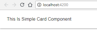
 <mat-card>
 <p>This Is Simple Card Component </p>
 </mat-card>
Using the card component of Angular Material, this code generates a simple card with the text "This Is Simple Card Component".
Output
Card With Title and Subtitle
Apart from the basic card component without any specific sections, We can provide a Title and Subtitle as well, we can make use of the in-built selector with the card header, below you can find the syntax for the same.
For showing the specific card component title and subtitle, we can opt for the additional selectors as given below.
- <mat-card-title>: Selector that is used to show the card title
- <mat-card-subtitle>: Selector to show the subtitle for the card component
Syntax
 <mat-card-title> … <mat-card-title>
 <mat-card-subtitle> … <mat-card-subtitle>
Example
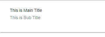
<mat-card>
 <mat-card-header>
 <mat-card-title>This is Main Title</mat-card-title>
 <mat-card-subtitle>This is Sub Title</mat-card-subtitle>
 </mat-card-header>
</mat-card>
Using the card components from Angular Material, this code creates a card with a header section that has the titles "This is Main Title" and "This is Sub Title."
Output
Card with header and footer
We have seen the example already that the card component can be divided into multiple sections i.e. header, content, and footer So that we can have a card in a distributed manner, and as per the structure, we can implement elements inside the card sections. There are two selectors available to show the header and footer.
- <mat-card-header>: To show the header of the card component
- <mat-card-footer>: To show the footer of the card component
As the name suggests, the header and footer parts can have different elements to show details about the single model and its different properties, let’s see a simple example.
Example
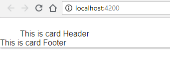
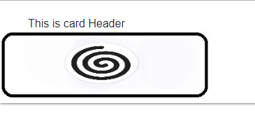
<mat-card>
 <mat-card-header>
 This is card Header
 </mat-card-header>
 <mat-card-footer>
 This is card Footer
 </mat-card-footer>
</mat-card>
Using the card components from Angular Material, this code creates a card with the header displaying "This is card Header" and the footer displaying "This is card Footer".
Output
Card with Content
We have just seen that we can use the header and footer section within the card to distribute elements throughout the card component, in the same way, we can provide the section for card content as well, you just need to follow the syntax and include any element inside the content section.
Syntax
<mat-card-content> … </mat-card-content>
Example
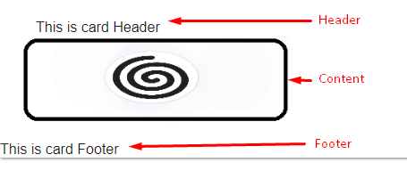
<mat-card>
 <mat-card-header>
 This is card Header
 </mat-card-header>
 <mat-card-content>
 <img src="./assets/logo.png" height="100px" width="300px"/>
 </mat-card-content>
 <mat-card-footer>
 This is card Footer
 </mat-card-footer>
</mat-card>
Using the card components of Angular Material, this code generates a card with a header, a content section that shows an image from the "assets" folder, and a footer.
Output
Card with image
Previously we have seen examples using static text as a part of the card, but we can have image elements with the card component as well. For that, there is a selector which is called mat-card-image which is used to include an image element in the card, and the selector is described below.
Syntax
<img mat-card-image />
Example
 <mat-card>
 <mat-card-header>
 This is card Header
 </mat-card-header>
 <mat-card-footer>
 <img mat-card-image src="./assets/logo.png" height="200px" width="300px">
 </mat-card-footer>
 </mat-card>
Using the card components of Angular Material, this code creates a card with a header and a footer that displays a picture from the "assets" folder styled as a card image.
Output
Card with action buttons
Sometimes we are required to perform a specific operation based on button click events, for that we can make use of the action buttons container for the card component. For that, we can use the selector called mat-card-actions to define a separate section in the card for action buttons as explained below.
<mat-card-actions> … </mat-card-actions>
Example
 <mat-card>
 <mat-card-header>
 This is card Header
 </mat-card-header>
 <mat-card-actions>
 <button mat-raised-button color="primary">Like</button>
 <button mat-raised-button color="accent">Share</button>
 <button mat-raised-button color="warn">Subscribe</button>
 </mat-card-actions>
 </mat-card>
Using Angular Material's card and button components, this code generates a card with a header and an action section that includes the Like, Share, and Subscribe buttons.
Output
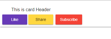
In the above example, I have used the material raised button which now acts as an action button, so this way we can include different action buttons within the action section of a material card component.
Complete Example Code
Module File
 // Material Components
 import {MatCardModule} from '@angular/material/card';
 import {MatDividerModule} from '@angular/material/divider';
 import {MatExpansionModule} from '@angular/material/expansion';
 import {MatListModule} from '@angular/material/list';
 import {MatStepperModule} from '@angular/material/stepper';
 import {MatTabsModule} from '@angular/material/tabs';
 import {MatTreeModule} from '@angular/material/tree';
 import { MatFormFieldModule , MatInputModule , MatButtonModule } from '@angular/material';

 imports: [
 MatCardModule,
 MatDividerModule,
 MatExpansionModule,
 MatListModule,
 MatStepperModule,
 MatTabsModule,
 MatTreeModule,
 MatFormFieldModule,
 MatInputModule,
 MatButtonModule
 ],
 exports: [
 MatCardModule,
 MatDividerModule,
 MatExpansionModule,
 MatListModule,
 MatStepperModule,
 MatTabsModule,
 MatTreeModule,
 MatFormFieldModule,
 MatInputModule,
 MatButtonModule
 ],
For use in the application's components, this code imports and registers different Angular Material modules for cards, dividers, expansions, lists, steppers, tabs, trees, form fields, inputs, and buttons.
Html File
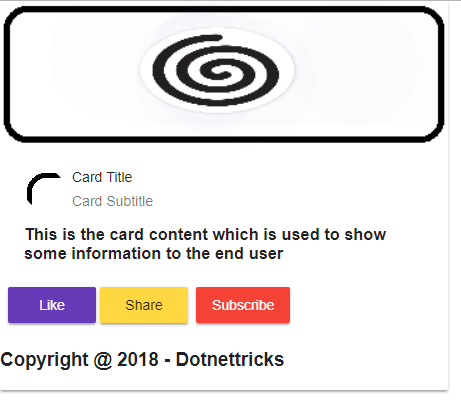
 <mat-card class="example-card">
 <img mat-card-image src="./assets/logo.png" alt="Photo of a Shiba Inu">
 <mat-card-header>
 <div mat-card-avatar class="avatarImage"></div>
 <mat-card-title>Card Title</mat-card-title>
 <mat-card-subtitle>Card Subtitle</mat-card-subtitle>
 </mat-card-header>
 <mat-card-content>
 <h3>This is the card content which is used to show some informaion to the end user</h3>
 </mat-card-content>
 <mat-card-footer>
 <h3>Copyright @ 2018 - Dotnettricks</h3>
 </mat-card-footer>
 <mat-card-actions>
 <button mat-raised-button color="primary">Like</button>
 <button mat-raised-button color="accent">Share</button>
 <button mat-raised-button color="warn">Subscribe</button>
 </mat-card-actions>
 </mat-card>
Using the card components of Angular Material, this code creates an effectively styled card with an image, a header with an avatar, title, and subtitle, a content section with information, a copyright footer, and a button section with actions such as share and subscribe.
Style sheet (styles.css)
 @import '~@angular/material/prebuilt-themes/deeppurple-amber.css';
 body {
 font-family: Roboto, Arial, sans-serif;
 margin: 0;
 }
 .avatarImage
 {
 background-image: url('./assets/logo.png');
 background-size: inherit;
 }
This code affects the avatar image to use a background image from the assets folder, removes body margins for the entire application, and applies a pre-built deep purple and amber color theme from Angular Material.
Output
Summary
The card component from Angular Material is adaptable and presents data in an eye-catching way. It is perfect for displaying information about individual issues because it has sections for the header, content, footer, picture integration, and action buttons. Cards offer an elegant and adaptable method to improve your user interface, whether you're working with basic text or more intricate layouts.
FAQs
Q1. How to use material dialog in Angular?
Calling the open method with a component to load and an optional configuration object opens a dialogue box. Let dialogRef = dialog.open(UserProfileComponent, { height: '400px', width: '600px', }); The MatDialogRef offers a handle on the opened dialogue. The open method will return an instance of MatDialogRef.
Q2. What is a dialog component?
A dialogue is an example of a modal window that shows up in front of the app's content and asks the user to choose or provide important information. Dialogues come on the screen and remain there until they are dismissed, confirmed, or a necessary action is made. When they do, all app functionality is disabled.
Q3. How to close the Angular material dialog box?
By default, the close icon located to the right of the dialogue header can be clicked by pressing the Esc key to close the dialogue. You can also use the hide method to close it by clicking outside of the dialogue box. You can stop the dialogue from closing when you press the Esc key by setting the closeOnEscape property value to false.