
 Previous Tutorial


25
AprGetting Started with jQuery UI
13 Feb 2024
Intermediate
2.24K Views
20 min read
jQuery UI will provide you wide range of widget which makes our application more powerful and user friendly. The jQuery UI plugin give you lot more flexibility to play over the widget through the script. Will see the majorly used jQuery UI widget in this article. We can easily add the jQuery UI plugin in our application using the CDN https://code.jquery.com/ui/1.12.0/jquery-ui.min.js
Accordion
Accordion is a widget which is used to expand/ collapse the content. jQuery UI provides different options, events and methods to customize the accordion widget based on the requirement.
HTML
 <!DOCTYPE html>
 <html lang="en" xmlns="http://www.w3.org/1999/xhtml">
 <head>
 <meta charset="utf-8" />
 <title></title>
 <script src="http://ajax.googleapis.com/ajax/libs/jquery/1.10.2/jquery.min.js"></script>
 <script src="https://code.jquery.com/ui/1.12.0/jquery-ui.min.js"
 integrity="sha256-eGE6blurk5sHj+rmkfsGYeKyZx3M4bG+ZlFyA7Kns7E="
 crossorigin="anonymous"></script>
 </head>
 <body>
 <div id="accordion">
 <h3>First header</h3>
 <div>First content panel</div>
 <h3>Second header</h3>
 <div>Second content panel</div>
 </div>
 </body>
 </html>
 <script type="text/javascript">
 $("#accordion").accordion();
 </script>
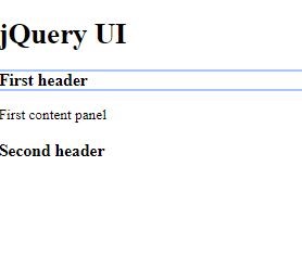
From the above code you can notice I have included Jquery-UI JS next to jquery JS
$("#accordion").accordion() - > will initialize the accordion widget to the div with id “accordion”.
Result
Let’s add the jQuery UI CSS to apply a default theme for the widget. Add below CSS link to the header of the HTML to apply a theme to the widget
<link rel="stylesheet" href="http://code.jquery.com/ui/1.12.1/themes/base/jquery-ui.css">
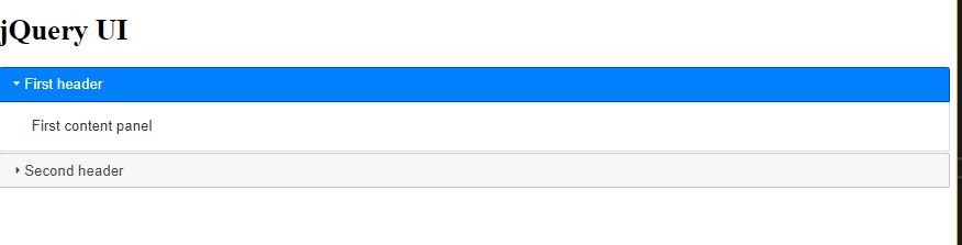
The above result shows the accordion which is applied for the element using jQuery UI.
Options : Mostly used options in accordionS.No
Options
Example
Description
1
classes
$( " selector " ).accordion({ classes: {"ui-accordion": "highlight"} });
It is used to apply CSS classes for the widget
disabled
$( ".selector" ).accordion({ disabled: true});
It is used to disable the accordion by defining a value as true
active
$( "selector" ).accordion({active: 1});
By default, 2nd panel will be opened, by default it will open first panel
event
$( ".selector" ).accordion({event: "mouseover"});
It is used to specific in which event the accordion should react, by default it will react for click event
header
$( "selector" ).accordion({header: "h3"});
It is used to specific the header option for the accordion
icons
$( ".selector" ).accordion({icons: { "header": "ui-icon-plus""activeHeader": "ui-icon-minus" }});
It is used to specific the icon option for the accordion
Read More - Advanced jQuery Interview Questions and Answers
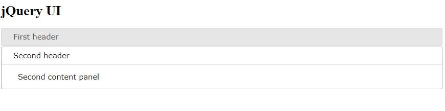
active
This option is used to define which panel should be opened by default, =>If active –> false, all the panel will be collapsed. By default, first panel will be opened always
HTML
 <div id="accordion">
 <h3>First header</h3>
 <div>First content panel</div>
 <h3>Second header</h3>
 <div>Second content panel</div>
</div>
JavaScript
 $( "#accordion" ).accordion({
 active: 1
 });
The active value is based on the index of the panel which starts from 0, so according to the script the 2nd panel which means index 1 will be opened by default.
Classes
Classes option is used to add CSS class for the widget.
HTML
 <html lang="en" xmlns="http://www.w3.org/1999/xhtml">
 <head>
 <meta charset="utf-8" />
 <title></title>
 <link rel="stylesheet" href="jquery-ui.css" />
 <script src="http://ajax.googleapis.com/ajax/libs/jquery/1.10.2/jquery.min.js"></script>
 <script src="https://code.jquery.com/ui/1.12.0/jquery-ui.min.js"
 integrity="sha256-eGE6blurk5sHj+rmkfsGYeKyZx3M4bG+ZlFyA7Kns7E="
 crossorigin="anonymous"></script>
 </head>
 <body>
 <h1>jQuery UI</h1>
 <div id="accordion">
 <h3>First header</h3>
 <div>First content panel</div>
 <h3>Second header</h3>
 <div>Second content panel</div>
 </div>
 </body>
 </html>
 <script type="text/javascript">

 $( "#accordion" ).accordion({
 active: 1,
 classes: {
 "ui-accordion": "highlight"
 }
 });
Result
Icons
Icons options is used to add the icons to the accordion
JavaScript
 $( "#accordion" ).accordion({
 active: 1,
 icons: { "header": "ui-icon-plus", "activeHeader": "ui-icon-minus" }
 });
Result
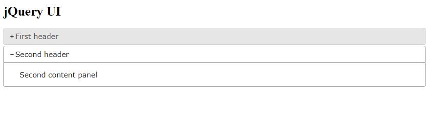
As per the code the + icon is added to the inactive header and – icon is added to the active header
Events
S.No
Events
Example
Description
1
activate
$( "selector" ).accordion({activate: function( event, ui ) {}})
This event will be fired once all the panel in accordion has been activated
2
beforeActivate
$( "selector" ).accordion({beforeActivate: function( event, ui ) {} });
This event will be fired before the panel has been activated
3.
create
$( ".selector" ).accordion({create: function( event, ui ) {}});
This event will be fired when the accordion is created.
Auto Complete
It will help the user to quickly find and select item from the pre-populated list of suggested values. So basically, the widget will search, and filter the data from the pre-defined list based on what user types in the input field. This widget comes with lot of options, methods and events.
The most commonly used optionsS.No
Options
Example
Description
1.
source
$( "selector" ).autocomplete({source: [ "apple", "orange", "grapes" ]});
It is used to create a pre-defined list of items which means a source for the autocomplete widget
2.
disabled
$( "selector" ).autocomplete({disabled: true});
It is used to disable the autocomplete
3.
delay
$( "selector" ).autocomplete({delay: 500});
It is used to provide some delay in displaying the filtered result I autocomplete
4.
autofocus
$( ".selector" ).autocomplete({autoFocus: true})
It is used to highlight/focus the first item of the widget
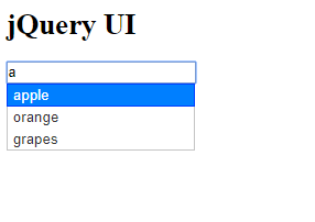
HTML
 <div class="ui-widget">
 <input id="autoComplete" type="text" />
 </div>
JavaScript
 $("#autoComplete").autocomplete({
 source: ["apple", "orange", "grapes"],
 autoFocus: true,
 delay: 500,

 });
autoFocus
it will focus the first item in the list
Result
var source = $("#autoComplete").autocomplete("option", "source");
The above code is used to get the value of source
$("#autoComplete").autocomplete("option", "source", ["c++", "java","javascript", "ASP"]);
The above code is used to set the value for source, Like this you can get and set the value for all the options which is available in widget.
Frequently used Autocomplete methodsS.no
Method
Example
Description
1
search
$( "selector" ).autocomplete( "search", [userInput] )
It is used to fire the search method of the widget by passing the value of string type
2
close
$( "selector" ).autocomplete( "close" )
It will close the autocomplete menu
3
instance
$( "selector" ).autocomplete( "instance" );
It will return a autocomplete instance object
4
enable
$( "selector" ).autocomplete( "enable" )
Enable the autocomplete
5
disable
$( ".selector" ).autocomplete( "instance" );
Disable the autocomplete
S.no
Events
Example
Description
1
Change
$( "selector" ).autocomplete({change: function( event, ui ) {}});
This event is fired when the value has changed by the use in autocomplete
2
Close
$( "selector" ).autocomplete({close: function( event, ui ) {}});
This event will be fired when the autocomplete is closed
3.
Open
( "selector" ).autocomplete({open: function( event, ui ) {}});
This event will be fired when the autocomplete is opened
4.
Select
$( "selector" ).autocomplete({select: function( event, ui ) {}});
This event is fired when user selects the item from the menu
5.
Response
$( "selector" ).autocomplete({response: function( event, ui ) {} })
This event is fired when the search completes
DatePicker
The datepicker widget in jQuery UI can be enabled using datepicker() function, which is used to display the calendar from where the user can pick the date.
HTML
 <div class="ui-widget">
 <input type="text" id="datepicker">
 </div>
JavaScript
 $(function () {
 $("#datepicker").datepicker();
 });
Result
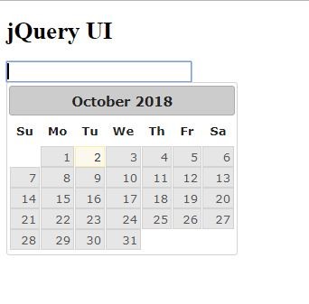
By default, the current date will be selected. jQuery UI provides different option, method and events to the date picker widget will see some of them. There are many options available for datepicker,
the most frequently used options are listed belowS.No
Options
Example
Description
1
changeMonth
$("#datepicker").datepicker({changeMonth: true});
It is used to provide the dropdownlist for the month selection
2.
changeYear
$("#datepicker").datepicker({changeYear: true });
It is used to provide the dropdownlist for the year selection
3.
dateFormat
$( "selector" ).datepicker({dateFormat: "yy-mm-dd" });
It is used to provide the format for the date selected
4
duration
$( "selector" ).datepicker({duration: "slow"});
It is used to control the speed of the datepicker which gets opened when the user click on the input field
HTML
 <div class="ui-widget">
 <input type="text" id="datepicker">
</div>
JavaScript
 $("#datepicker").datepicker({
 changeMonth: true,
 changeYear: true,
 dateFormat: "yy-mm-dd",
 duration:"slow"
 });
Result
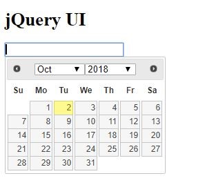
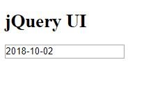
You can notice the month and year dropdown, and when user select the date it will be formatted to the format which is defined in datapicker().
Frequently used Methods in DatePickerS.No
Method
Example
Description
1
getDate()
$( "selector" ).datepicker( "getDate" )
It is used to return the current date from the datepicker
2
hide()
$( "selector" ).datepicker( "hide" );
It is used to close the previously opened date picker
3
show()
$( "selector" ).datepicker( "show" )
It is used to open the datepicker
4
refresh()
$( ".selector" ).datepicker( "refresh" );
It is used to refer by reset the external customization
Note : There is no event for the datepicker.
Tabs
It is a single content area with multiple panels.
HTML
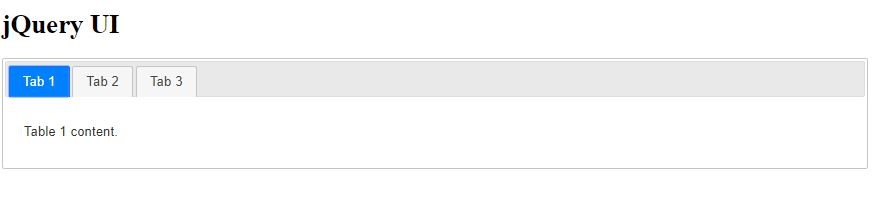
 <div id="tabs">
 <ul>
 <li><a href="#tabs-1">Tab 1</a></li>
 <li><a href="#tabs-2">Tab 2</a></li>
 <li><a href="#tabs-3">Tab 3</a></li>
 </ul>
 <div id="tabs-1">
 <p>Table 1 content.</p>
 </div>
 <div id="tabs-2">
 <p>Tab 2 content.</p>
 </div>
 <div id="tabs-3">
 <p>Tab 3 content.</p>

 </div>
 </div>
JavaScript
 $(function () {
 $("#tabs").tabs();
 });
Result
S.No
Options
Example
Description
1
active
$( "selector" ).tabs({active: 1});
As like accordion it is used to activate the tab, based on the index value the tab menu in the widget will be activated
2
collapsible
$( "selector" ).tabs({collapsible: true});
It is used to collapse all the tab menu in the widget
3.
event
$( "selector" ).tabs({event: "mouseover"})
Instead of mouse click to open the menu by default, we can defined which type of event is used to open the menu
4.
disabled
$( "selector" ).tabs({disabled: [ 0, 2 ]});
It is used to disable the tab menu based on the index value
HTML
 <!DOCTYPE html>

 <html lang="en" xmlns="http://www.w3.org/1999/xhtml">
 <head>
 <meta charset="utf-8" />
 <title></title>
 <link rel="stylesheet" href="jquery-ui.css" />
 <link rel="stylesheet" href="http://code.jquery.com/ui/1.12.1/themes/base/jquery-ui.css">
 <script src="http://ajax.googleapis.com/ajax/libs/jquery/1.10.2/jquery.min.js"></script>
 <script src="https://code.jquery.com/ui/1.12.0/jquery-ui.min.js"
 integrity="sha256-eGE6blurk5sHj+rmkfsGYeKyZx3M4bG+ZlFyA7Kns7E="
 crossorigin="anonymous"></script>
 </head>
 <h1>jQuery UI</h1>
 <div id="tabs">
 <ul>
 <li><a href="#tabs-1">Tab 1</a></li>
 <li><a href="#tabs-2">Tab 2</a></li>
 <li><a href="#tabs-3">Tab 3</a></li>
 </ul>
 <div id="tabs-1">
 <p>Table 1 content.</p>
 </div>
 <div id="tabs-2">
 <p>Tab 2 content.</p>
 </div>
 <div id="tabs-3">
 <p>Tab 3 content.</p>

 </div>
 </div>

 </html>
JavaScript
 $("#tabs").tabs({
 active: 1,
 disabled: [2],
 event:"mouseover"
 });
Result
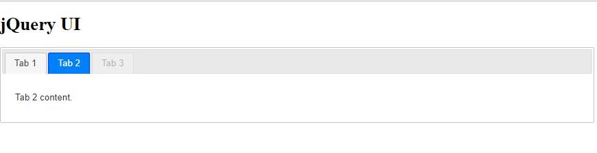
As per the code the 2nd tab is selected by default and the third tab is disabled.
most frequently used methods in Tabs is listed belowS.No
Method
Example
Description
1.
load(index)
$( "selector" ).tabs( "load", 0 );
It is used to invoke the load method of remote tab widget here we can overload with the tab menu index value
2.
load(href)
$( "selector" ).tabs( "load", “tabs-1” );
It is used to invoke the load method of remote tab widget here we can overload with the tab menu href value
3
enable()
$( "selector" ).tabs( "enable" )
It is used to enable all the tabs
4.
disable()
$( ".selector" ).tabs( "disable" )
It is used to disable all the tabs
disable()
JavaScript
 $("#tabs").tabs({
 active: 1,
 event:"mouseover"
 });

 $("#tabs").tabs("disable");
Result
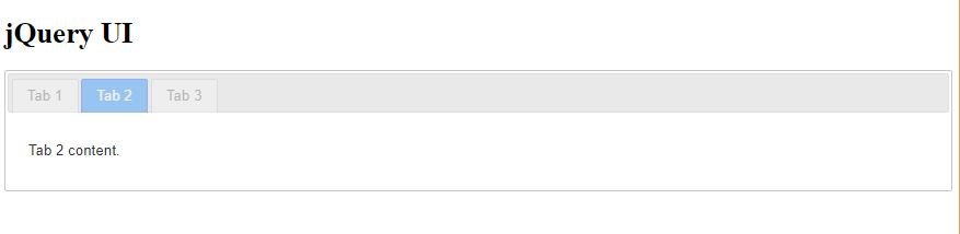
As per the code you can notice all the tab menu are disabled.
The most frequently used events in tabs are list belowS.No
Event
Example
Description
1
active
$( "selector" ).tabs({activate: function( event, ui ) {}});
This event is fired after the tabs get activated
2.
beforeActivate
$( "selector" ).tabs({beforeActivate: function( event, ui ) {}});
This event is fired before the tabs get activated.
3.
create
$( "selector" ).tabs({create: function( event, ui ) {}});
It is fired when the tabs are created
4
Load
$( "selector" ).tabs({load: function( event, ui ) {}});
It is fired when the remote tab has been loaded
Tooltip
This tooltip is customizable which can replace the native tooltip. When user mouse over the element the tooltip will be displayed.
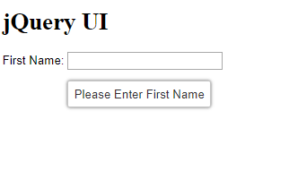
HTML
 <div class="ui-widget">
 <label>First Name: </label>
 <input type="text" id="txtFirstName" title="Please Enter First Name">
 </div>
JavaScript
 $(function () {
 $(document).tooltip();
 });
It will initialize the jQuery UI tooltip() for the document
Result
S.No
Option
Example
Description
1
content
$( "selector" ).tooltip({content: "Enter title"});
It is used to define the tooltip content
2
disabled
$( "selector" ).tooltip({disabled: true});
It is used to disable the tooltip
3
position
$( ".selector" ).tooltip({position: { at: "right" }});
It is used to display the tooltip in desired position
4
hide
$( ".selector" ).tooltip({hide: { effect: "explode", duration: 1000 }});
It is used to animate while hiding the tooltip
HTML
 <div class="ui-widget">
 <label>First Name: </label>
 <input type="text" id="txtFirstName" title="" >
 </div>
JavaScript
 $(document).ready(function () {
 $("#txtFirstName").tooltip({
 content: "Please Enter First Name",
 position: { at: "right" },
 hide: { effect: "explode", duration: 1000 },
 });

 })
Result
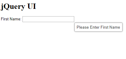
As per the code the tooltip position is aligned to right and the content is loaded from tooltip function
Frequently used methods in jQuery UI TooltipS.No
Methods
Example
Description
1
close()
$( "selector" ).tooltip( "close" );
It is used to close the tooltip
2
destroy()
$( "selector" ).tooltip( "destroy" );
It destroys the tooltip functionality completely
3
open()
$( "selector" ).tooltip( "open" );
It is used to open the tooltip
4.
enable()
$( "selector" ).tooltip( "enable" );
It is used to enable the tooltip
5.
disable()
$( "selector" ).tooltip( "disbale" );
It is used to disable the tooltip
S.No
Events
Example
Description
1
close
$( ".selector" ).tooltip({close: function( event, ui ) {}});
This event triggers when the tooltip closed
2.
open
$( ".selector" ).tooltip({ open: function( event, ui ) {}});
This event triggers when the tooltip open
HTML
 <div class="ui-widget">
 <label>First Name: </label>
 <input type="text" id="txtFirstName" title="" >
 </div>
JavaScript
 $(document).ready(function () {
 $("#txtFirstName").tooltip({
 content: "Please Enter First Name",
 position: { at: "right" },
 hide: { effect: "explode", duration: 1000 },
 close: function (event, ui) {
 console.log("close event fired")
 },
 open: function (event, ui) {
 console.log("open event fired")
 console.log(ui);
 },
 });

 })
Result
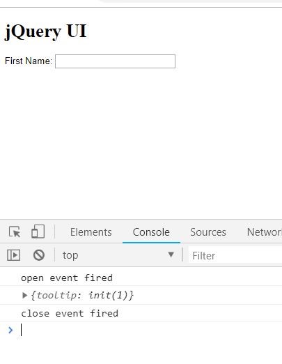
From the above result you can notice the open and close event is fired when we mouse over the field where the tooltip is initialized.
Summary
We have seen how to implement the accordion, datapicker, auto complete, tabs and tooltip widget using the jQuery UI plugin, and different kind of options, methods and events available for each widget which makes it more powerful.