


25
apr.Understanding jQuery Mobile Toolbars
07 sep. 2022
Beginner
11,9K Views
5 min read
jQuery Mobile offers two standard types of toolbars: Headers and Footers. Header bar may contain the page title, search button, back button, navigation links or navbar. Typically header bar is the first element inside each mobile page.
Footer bar may contain the footer navigation links, copyright information or other information. Typically footer bar is the last element inside each mobile page.
Toolbar positioning options
jQuery mobile allows you to set the position of header and footer by using following three ways:
Inline
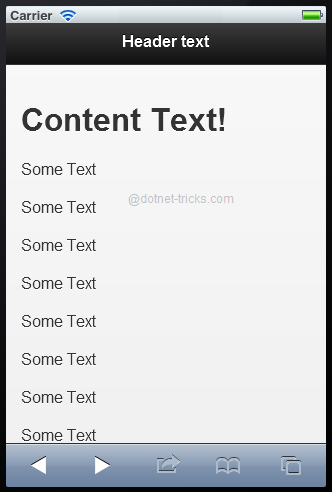
This is the by default position for header and footer. This position set the header and footer to inline with the page content.
<div data-role="page">
 <div data-role="header" data-position="inline">
 <h1>Header text</h1>
 </div>
 <div data-role="content">
 <h1>Content Text!</h1>
 <p>
 Some Text
 <br /><br />Some Text
 <br /><br />Some Text
 <br /><br />Some Text
 <br /><br />Some Text
 <br /><br />Some Text
 <br /><br />Some Text
 <br /><br />Some Text
 <br /><br />Some Text
 <br /><br />Some Text
 </p>
 </div>
 <div data-role="footer" data-position="inline">
 <h1>Footer Text</h1>
 </div>
</div>
Fixed
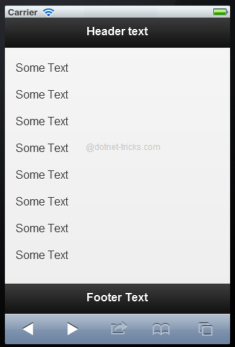
This position fixed the header and footer positions at the top and bottom of the page.
<div data-role="page">
 <div data-role="header" data-position="fixed">
 <h1>Header text</h1>
 </div>
 <div data-role="content">
 <h1>Content Text!</h1>
 <p>
 Some Text
 <br /><br />Some Text
 <br /><br />Some Text
 <br /><br />Some Text
 <br /><br />Some Text
 <br /><br />Some Text
 <br /><br />Some Text
 <br /><br />Some Text
 <br /><br />Some Text
 <br /><br />Some Text
 </p>
 </div>
 <div data-role="footer" data-position="fixed">
 <h1>Footer Text</h1>
 </div>
</div>
Fullscreen
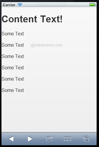
It behaves like fixed position but except that tapping the screen will hide or show the header and footer. This position is best for images and videos. For this you need to use data-fullscreen attribute with data-position attribute.
<div data-role="page">
 <div data-role="header" data-position="fixed" data-fullscreen="true">
 <h1>Header text</h1>
 </div>
 <div data-role="content">
 <h1>Content Text!</h1>
 <p>
 Some Text
 <br /><br />Some Text
 <br /><br />Some Text
 <br /><br />Some Text
 <br /><br />Some Text
 <br /><br />Some Text
 </p>
 </div>
 <div data-role="footer" data-position="fixed" data-fullscreen="true">
 <h1>Footer Text</h1>
 </div>
</div>
jQuery Mobile Navigation Bars
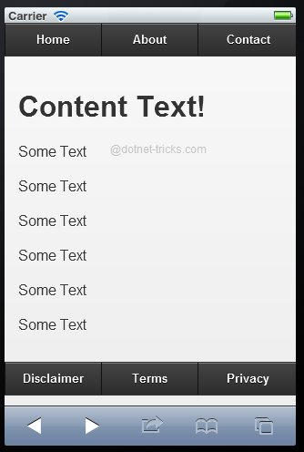
Typically, the header and footer have a navigation bar which contains a set of navigation links that are aligned horizontally. jQuery mobile allows you to create navigation bar by using data-role="navbar" attribute as given below:
<div data-role="page">
 <div data-role="header">
 <div data-role="navbar">
 <ul>
 <li><a href="#anylink">Home</a></li>
 <li><a href="#anylink">About</a></li>
 <li><a href="#anylink">Contact</a></li>
 </ul>
 </div>
 </div>
 <div data-role="content">
 <h1>Content Text!</h1>
 <p>
 Some Text
 <br /><br />Some Text
 <br /><br />Some Text
 <br /><br />Some Text
 <br /><br />Some Text
 <br /><br />Some Text
 </p>
 </div>
 <div data-role="footer">
 <div data-role="navbar">
 <ul>
 <li><a href="#anylink">Disclaimer</a></li>
 <li><a href="#anylink">Terms</a></li>
 <li><a href="#anylink">Privacy</a></li>
 </ul>
 </div>
 </div>
</div>
By default, all the navigation links in the navigation bar will be automatically turned into buttons.
What do you think?
I hope you have enjoyed the article and would able to have a clear picture about jQuery Mobile toolbars. I would like to have feedback from my blog readers. Your valuable feedback, question, or comments about this article are always welcome.
Take our free skill tests to evaluate your skill!

In less than 5 minutes, with our skill test, you can identify your knowledge gaps and strengths.
