 Previous Tutorial


28
apr.A Glimpse into XAML with Windows Store Apps
19 sep. 2018
Beginner
8,5K Views
6 min read
XAML pronounced as "ZAMEL" is a markup language that is used to design UI for .Net Application. It has been started to use in WPF development for making impressive UI for window application. XAML is similar to html and based on XML. XAML files are XML files and usually have the .xaml extension.
For developing your windows store apps using C#, Visual C++ and VB, you have to use XAML to UI of your apps. XAML help you to create your windows app UI such as controls, shapes, text, and other content presented on the screen.
XAML in Visual Studio 2012
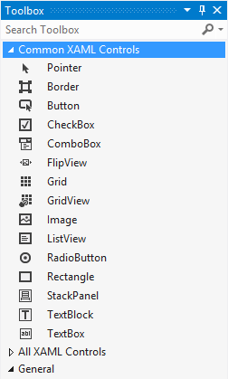
With VS 2012, you have a powerful editor to work XAML controls and create pages for your apps. As shown in fig. you have different XAML controls with in the toolbox to make your app UI more fluid, modern and impressive.
XAML Properties
There are two ways to define property values in XAML.
Attribute Syntax
Attribute syntax is simple and like as Html syntax attribute="value".
<Rectangle Fill="Red" />
Property Element syntax
Another syntax is property element syntax for defining attribute like as xml.
<Rectangle>
 <Rectangle.Fill>
 <SolidColorBrush Color="Red" />
 </Rectangle.Fill>
</Rectangle>
Controls For Windows Apps
As shown in above fig. VS 2012 toolbox has a handy list of XAML controls. Let's have a look at what controls are available for making your great windows apps.
Layout Controls
Layout is the most important part of your UI. If you create your windows app using Html and CSS, you have to use <div> tag for making your page layout. When you create your Windows Store app using XAML, it offers Grid, StackPanel, Canvas and ScrollViewer control for handling your page layout.
Grid
The Grid control offers a flexible table like approach to layout. A Grid control has a collection of rows and columns that you can use to manage your layout.
<Grid x:Name="MainGrid">
<Grid.RowDefinitions>
<RowDefinition />
<RowDefinition />
</Grid.RowDefinitions>
<Grid.ColumnDefinitions>
<ColumnDefinition />
<ColumnDefinition />
<ColumnDefinition />
<ColumnDefinition />
</Grid.ColumnDefinitions>
</Grid>
Stack Panel
The StackPanel acts a a container for others controls that stacks objects vertically or horizontally. There are no columns or rows to deal with in this control. By default, the StackPanel can place objects in the vertical Orientation. The StackPanel simply places controls next to each other. You may use the Margin properties of the controls with in the StackPanel to create some space between controls.
<StackPanel Orientation="Horizontal">
<Button Margin="5" Content="Inside StackPanel" />
<Button Margin="5" Content="Inside StackPanel" />
</StackPanel>
Canvas
Sometimes you may need to use an approach that is closer to absolute positioning of your controls. In this case, Canvas will help you to do with your objects. Canvas uses Top and Left to determine where the objects should display on the screen.
<Canvas Grid.Row="1">
<Button Content="Positioned Button" Canvas.Left="1165" Canvas.Top="478"/>
<TextBlock Canvas.Left="154" Text="Positioned Text"
Canvas.Top="142" FontSize="24"/>
<TextBlock Canvas.Left="425" Text="Positioned Text"
Canvas.Top="116" FontSize="24"/>
<TextBlock Canvas.Left="317" Text="Positioned Text"
Canvas.Top="458" FontSize="24"/>
</Canvas>
Moreover, if you want to create a simple game for Windows 8. The Canvas control gives you an easy area to place shapes and images, and because of the attached Left and Top properties, it also gives you an easy way to move them in code.
ScrollViewer
ScrollViewer simply acts as a container for any content that may overflow the visible part of the screen. It can handle scrolling content vertically or horizontally depending on your preferences.
<ScrollViewer Margin="0" Grid.Row="1" VerticalScrollBarVisibility="Hidden"
HorizontalScrollBarVisibility="Visible" HorizontalScrollMode="Enabled"
VerticalScrollMode="Disabled" BorderThickness="5" BorderBrush="White">
<StackPanel Orientation="Horizontal">
<Button Content="Button" VerticalAlignment="Top" Margin="50,50,50,0"/>
<Button Content="Button" VerticalAlignment="Top" Margin="50,50,50,0"/>
<Button Content="Button" VerticalAlignment="Top" Margin="50,50,50,0"/>
<Button Content="Button" VerticalAlignment="Top" Margin="50,50,50,0"/>
<Button Content="Button" VerticalAlignment="Top" Margin="50,50,50,0"/>
<Button Content="Button" VerticalAlignment="Top" Margin="50,50,50,0"/>
<Button Content="Button" VerticalAlignment="Top" Margin="50,50,50,0"/>
<Button Content="Button" VerticalAlignment="Top" Margin="50,50,50,0"/>
<Button Content="Button" VerticalAlignment="Top" Margin="50,50,50,0"/>
<Button Content="Button" VerticalAlignment="Top" Margin="50,50,50,0"/>
<Button Content="Button" VerticalAlignment="Top" Margin="50,50,50,0"/>
<Button Content="Button" VerticalAlignment="Top" Margin="50,50,50,0"/>
<Button Content="Button" VerticalAlignment="Top" Margin="50,50,50,0"/>
<Button Content="Button" VerticalAlignment="Top" Margin="50,50,50,0"/>
<Button Content="Button" VerticalAlignment="Top" Margin="50,50,50,0"/>
<Button Content="Button" VerticalAlignment="Top" Margin="50,50,50,0"/>
</StackPanel>
</ScrollViewer>
Action Controls
Like WebForm and Window form, there are some controls that you can use for user interaction like Button, TextBlock, TextBox, ComboBox, and much more.
TextBlock
The TextBlock control is used to display text on the screen and is equivalent to <div> tag or Label control in ASP.NET.
<TextBlock Text="This is some text" />
TextBox
The TextBox control is used for taking data input from the user.
<TextBox Text="" />
Button
The Button control enables the user to click or touch to perform an action.
<Button x:Name="StandardButton" Content="Save" />
CheckBox
The CheckBox control supports the typical checked and unchecked states for a content like checkbox in Asp.Net.
<CheckBox x:Name="MainCheck" Content="CheckBox" Checked="MainCheck_Checked" Unchecked="MainCheck_Unchecked" IsThreeState="True"/>
ComboBox
The ComboBox control provides you a list of options to select from like DropDownList in Asp.Net.
<ComboBox x:Name="MainCombo">
<ComboBoxItem Content="ASP.NET"/>
<ComboBoxItem Content="WPF"/>
<ComboBoxItem Content="Silverlight"/>
<ComboBoxItem Content="WinForms"/>
<ComboBoxItem Content="WinRT"/>
<ComboBoxItem Content="Select Item" IsSelected="True"/>
</ComboBox>
What do you think?
I hope you will enjoy the tips while making your windows apps. I would like to have feedback from my blog readers. Your valuable feedback, question, or comments about this article are always welcome.
Take our free skill tests to evaluate your skill!

In less than 5 minutes, with our skill test, you can identify your knowledge gaps and strengths.
