
 Previous Tutorial


25
apr.What’s new in Xamarin Forms 3.x
26 aug. 2022
Beginner
9,31K Views
10 min read
Xamarin released Xamarin.Forms 3.0 with the intuitive features mostly related to layout and styling. This release is claimed to be the fastest, richest till date attached with great improvements. Also, it has been reported that XAML compilation time has been reduced by 88% in some benchmarks.In this article, we are going to discuss about the new features included in this release with example. So let’s get started! with Xamarin traning.
Xamarin.Forms 3.0
This release introduces new improvements and features like Visual State Manager, Flex Layout, Style Sheets, and Right-to-Left Support.
Visual State Manager
Visual Stage Manager (VSM) is introduced in Xamarin.Forms 3.0. We can plan various situations of layouts and controls in XAML or C# and easily update or make changes to our UI. A simple Xamarin.Forms control ‘Button’ can have various states like Pressed, Disabled, and Focused.
Let suppose, we have input field Entry view, and we want the visual appearance of the Entry to change in the following ways :
In normal state, Entry field should have Red background.
In focused state, Entry field should have Gray background with font-size 50.
 <StackLayout>
 <StackLayout.Resources>
 <Style TargetType="Entry">
 <Setter Property="Margin" Value="20, 10" />
 <Setter Property="FontSize" Value="22" />
 <Setter Property="VisualStateManager.VisualStateGroups">
 <VisualStateGroupList>
 <VisualStateGroup>

 <VisualState x:Name="Normal">
 <VisualState.Setters>
 <Setter Property="BackgroundColor" Value="Red" />
 </VisualState.Setters>
 </VisualState>

 <VisualState x:Name="Focused">
 <VisualState.Setters>
 <Setter Property="FontSize" Value="50" />
 <Setter Property="BackgroundColor" Value="Gray" />
 </VisualState.Setters>
 </VisualState>
 </VisualStateGroup>
 </VisualStateGroupList>
 </Setter>
 </Style>
 </StackLayout.Resources>

 <Label Text="Entry:" Margin="25, 35, 25, 10" FontSize="Medium"/>

 <Entry />
 </StackLayout>
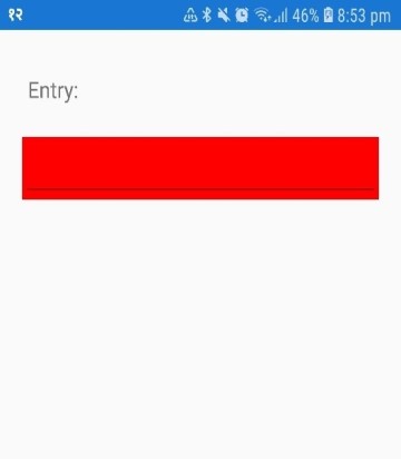
Figure 1: Entry in focused state
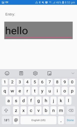
Figure 2: Entry in focused state
FlexLayout
If we want to place children horizontally or vertically then we can use FlexLayout. It is similar to StackLayout.
example : Place items horizontally<FlexLayout Direction="Row" AlignItems="Center" JustifyContent="SpaceEvenly"> <Label Text="FlexLayout Demo" FontSize="Large" /> <Button Text="My Button" /> <Label Text="Hello World" /> </FlexLayout>
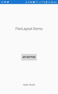
Figure 3: Items in horizontal
 <FlexLayout Direction="Column"
 AlignItems="Center"
 JustifyContent="SpaceEvenly">

 <Label Text="FlexLayout Demo" FontSize="Large" />

 <Button Text="My Button" />

 <Label Text="Hello World" />
 </FlexLayout>
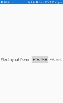
Figure 4: Items in vertical
StyleSheets
Just like in web-development, Cascading Style Sheets (CSS) is introduced in this release. We can style our controls using CSS.In XAML, CSS can be loaded in 2 simple ways.
First Method : We can directly load from the Resource directory.
 <ContentPage>
 <ContentPage.Resources>
 <StyleSheet Source="/Assets/mystyles.css" />
 </ContentPage.Resources>
 </ContentPage>
Second Method : We can parse with StyleSheet class by inlining it in a CDATA section.
 <ContentPage>
 <ContentPage.Resources>
 <StyleSheet>
 <![CDATA[
 ^contentpage {
 background-color: red;
 }
 ]]>
 </StyleSheet>
 </ContentPage.Resources>
 </ContentPage>
We can load the CSS file as an embedded resource in C# Code behind also.
 namespace App1
 {
 [XamlCompilation(XamlCompilationOptions.Compile)]
 public partial class Page1 : ContentPage
 {
 public Page1()
 {
 InitializeComponent();
 this.Resources.Add(StyleSheet.FromAssemblyResource(
 IntrospectionExtensions.GetTypeInfo(typeof(Page1)).Assembly,
 "App1.Assets.myStyles.css"));
 }
 }
 }
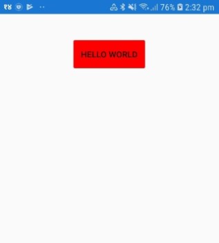
For example : MainPage.xaml
 <?xml version="1.0" encoding="utf-8" ?>
 <ContentPage xmlns="http://xamarin.com/schemas/2014/forms"
 xmlns:x="http://schemas.microsoft.com/winfx/2009/xaml"
 xmlns:local="clr-namespace:App1"
 x:Class="App1.MainPage">

 <ContentPage.Resources>
 <StyleSheet Source="/Assets/mystyles.css" />
 </ContentPage.Resources>
 <StackLayout Margin="0,20,0,0">
 <Button
 Text="Hello World"
 x:Name="btn"
 Margin="5,25,5,5"
 HorizontalOptions="Center"/>
 </StackLayout>
 </ContentPage>
Inside Assets folder, lets add a mystyles.css button and add the following code. This code is setting the background color of button to red which has id btn.
 #btn {
 background-color: red;
 }
Right-to-Left
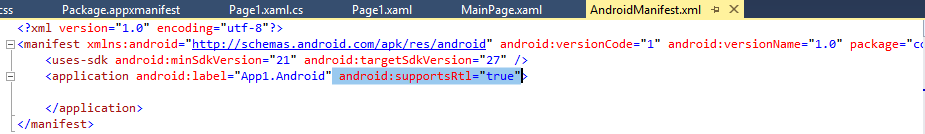
This feature is introduced to support languages that appears right-to-left. For example: Arabic and Hebrew. We can use FlowDirection property on any VisualElement rather than using platform-specifics and updating via code. We can simply add this FlowDirection="{x:Static Device.FlowDirection}" in the head of our XAML Page.
For exampleIn Android, we have to add android:supportsRtl="true" in our application tag in AndroidManifest.xml with MinSDKVersion is 17+.
For UWP, we need to add following two languages in Package.appmanifest file inside Resources tag.
 <Resource Language="en" />
 <Resource Language="ar" />
For iOS, we need to add in the CFBundleLocalizations section of our Info.plist, with iOS 9+.
 <string>en</string>
 <key>CFBundleLocalizations</key>
 <array>
 <string>en</string>
 <string>ar</string>
 </array>
So in MainPage.xaml, lets add a label and entry as below
 <?xml version="1.0" encoding="utf-8" ?>
 <ContentPage xmlns="http://xamarin.com/schemas/2014/forms"
 xmlns:x="http://schemas.microsoft.com/winfx/2009/xaml"
 xmlns:local="clr-namespace:App1"
 FlowDirection="{x:Static Device.FlowDirection}"
 x:Class="App1.MainPage">

 <StackLayout Margin="0,20,0,0">
 <Label Text="What is your name"></Label>
 <Entry Text="My name is Xamarin"></Entry>
 </StackLayout>

 </ContentPage>
Here, we have added FlowDirection in the head of out page in XAML. On running the application, we can see the flow direction is from right to left in figure 6 since we have changed the device language to Arabic.
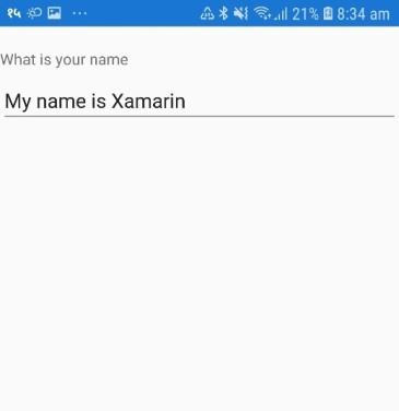
Figure 5: UI on English language
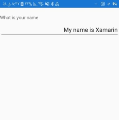
Figure 6: UI on Arabic language
In older versions, we need to define colors and styles throughout the application wherever required as below
Page.xaml <StackLayout Margin="0,20,0,0">
<StackLayout.Resources>
<ResourceDictionary>
<Style x:Key="MyTextProperty" TargetType="Button">
<Setter Property="FontAttributes" Value="Italic" />
<Setter Property="FontSize" Value="Large" />
<Setter Property="Text" Value="Hello World" />
</Style>
</ResourceDictionary>
</StackLayout.Resources>
<Button
TextColor="{StaticResource TextColor}"
Margin="5,25,5,5"
HorizontalOptions="Center"
Style="{StaticResource MyTextProperty}" />
</StackLayout>
App.xaml
 <Application.Resources>
 <ResourceDictionary>
 <Color x:Key="TextColor">Red</Color>
 </ResourceDictionary>
 </Application.Resources>
Using the Merged Dictionaries, we can merge one dictionary with another using the MergedWith stuff.
App.xaml<Application.Resources> <ResourceDictionary MergedWith="local:MyColor"> <Color x:Key="TextColor">Red</Color> </ResourceDictionary> </Application.Resources>
In this case, the primary dictionary is merged with another resource dictionary of colors.
 <ResourceDictionary
 xmlns="http://xamarin.com/schemas/2014/forms"
 xmlns:x="http://schemas.microsoft.com/winfx/2009/xaml"
 x:Class="App1. MyColor ">
 <Color x:Key="TextColor">Red</Color>
 </ResourceDictionary>
For this we need a class as :
 public partial class MyColor : ResourceDictionary
 {
 //
 }
With the new Xamarin.Forms 3.0 release, we can merge multiple dictionaries instead of one. We can use MergedDictionaries collection property instead of MergedWith.
 <Application.Resources>
 <ResourceDictionary>
 <ResourceDictionary.MergedDictionaries>
 <local:MyColor />
 <!-- More resource dictionaries can be added here-->
 </ResourceDictionary.MergedDictionaries>
 <Color x:Key="TextColor">Red</Color>
 </ResourceDictionary>
 </Application.Resources>
Xamarin.Forms 3.1.0 Major Feature
Android Bottom Tabs
With this release, Android TabBar can be moved to the location you require: Top, Bottom, Default.
From Code Behind :On<Android>().SetToolbarPlacement(ToolbarPlacement.Bottom);From XAML :
 <?xml version="1.0" encoding="utf-8"?>
 <TabbedPage xmlns="http://xamarin.com/schemas/2014/forms"
 xmlns:android="clr-namespace:Xamarin.Forms.PlatformConfiguration.AndroidSpecific;assembly=Xamarin.Forms.Core"
 android:TabbedPage.ToolbarPlacement="Bottom"
example
Lets add a TabbedPage and include android:TabbedPage.ToolbarPlacement="Bottom" in the head of Page as shown below in XAML code.
 <?xml version="1.0" encoding="utf-8" ?>
 <TabbedPage xmlns="http://xamarin.com/schemas/2014/forms"
 xmlns:x="http://schemas.microsoft.com/winfx/2009/xaml"
 x:Class="App1.TabbedPage1"
 xmlns:android="clr-namespace:Xamarin.Forms.PlatformConfiguration.AndroidSpecific;assembly=Xamarin.Forms.Core"
 android:TabbedPage.ToolbarPlacement="Top"
 >
 <!--Pages can be added as references or inline-->
 <ContentPage Title="Tab 1" />
 <ContentPage Title="Tab 2" />
 <ContentPage Title="Tab 3" />
 </TabbedPage>
Here, We have three options to set the position of Tabbar in android. i.e. Top, Bottom and Default.
android:TabbedPage.ToolbarPlacement="Top"
sets the Tabbar to appear at the top whereas ,
android:TabbedPage.ToolbarPlacement="Bottom"
sets the Tabbar in the bottom of page.
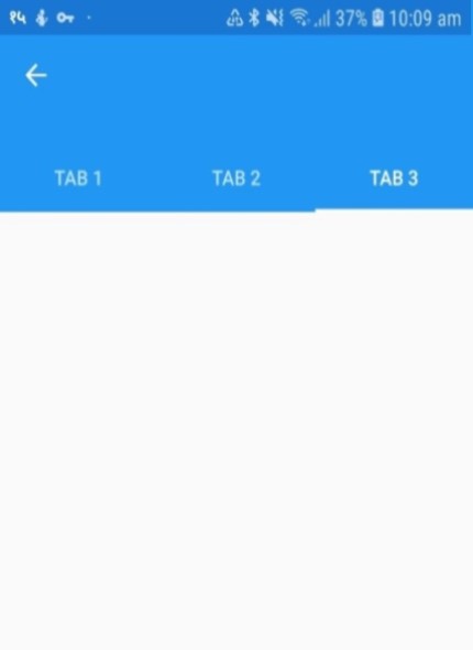
Figure 7: Tabs in Top
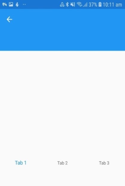
Figure 8: Tabs in Bottom
We can achieve this from the C# code behind too as shown below.
 using System;
 using System.Collections.Generic;
 using System.Linq;
 using System.Text;
 using System.Threading.Tasks;

 using Xamarin.Forms;
 using Xamarin.Forms.PlatformConfiguration;
 using Xamarin.Forms.PlatformConfiguration.AndroidSpecific;
 using Xamarin.Forms.Xaml;

 namespace App1
 {
 [XamlCompilation(XamlCompilationOptions.Compile)]
 public partial class TabbedPage1 : Xamarin.Forms.TabbedPage
 {
 public TabbedPage1 ()
 {
 InitializeComponent();
 On<Android>().SetToolbarPlacement(ToolbarPlacement.Top);
 }
 }
 }
Conclusion
Xamarin released features that helps to improve UI and mostly stylings. Also, there are some more minor enhancements that are included in this release. Xamarin.Forms 3.2.0 has also minor enhancements against the issues and bugs that were reported by developers. With this release now you can minimize your development time on UI part. So, what are you waiting for? Thank you for the time, I hope you enjoyed the article. Please add your questions below if have some questions regarding Xamarin training as we can help you learn how to build mobile apps using Xamarin Forms.
Take our free skill tests to evaluate your skill!

In less than 5 minutes, with our skill test, you can identify your knowledge gaps and strengths.
