


26
apr.Xamarin Forms Fundamentals
26 aug. 2022
Beginner
26,3K Views
4 min read
Xamarin training allows developers to build a cross-platform mobile app using the common UI pages, layouts, views, controls, and design patterns. At runtime, each Xamarin Forms UI element will be mapped to its native equivalent element in each platform, so that truly native UI can be built and rendered.
Xamarin Forms Fundamentals
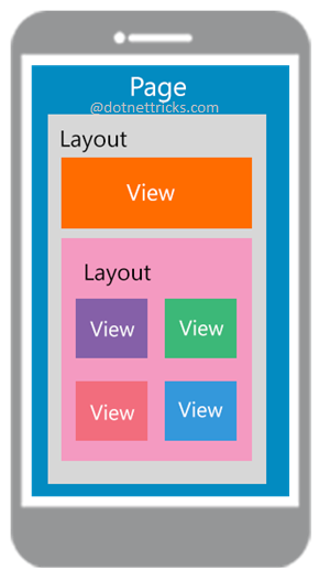
Page
The page represent cross-platform mobile app screen. A page contains layouts and views to display app data and handle user interaction.
A Xamarin Forms page represents a
View Controllerin iOS or aPagein Windows Phone/UWP oran activityin Android. Xamarin forms have following different types of pages for displaying UI elements.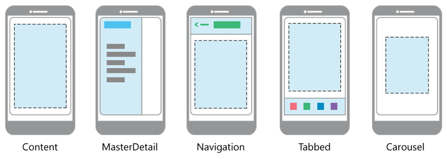 PagesDescriptionContent PageContains a single viewMasterDetailPageA page that has two panes for the page. Typically, the master will contain the likes of a menu with the detail the content.NavigationPageA page that contains a navigation bar. Pages are kept on a stack and can be jumped between. The Navigation bar can have navigation buttons as well as a title.TabbedPageA container page. The TabbedPage acts as a container holding the content pages associated with each tab.CarouselPageA page that allows for sweeping across to show other views.
Views
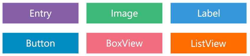
Xamarin views are the UI elements/controls displayed on the user interface, such as labels, buttons and text entry boxes. The basic views are shown in fig.
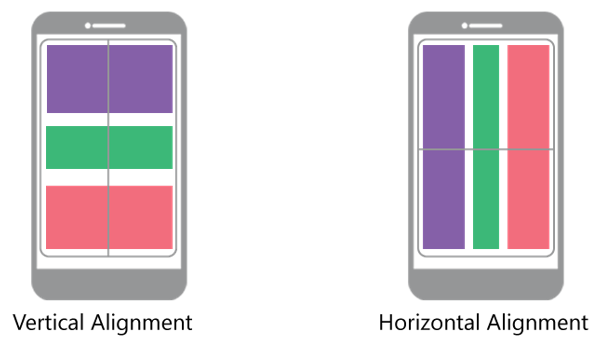
Xamarin forms views can be aligned vertically and horizontally using VerticalOptions and HorizontalOptions.
Layouts
Layouts are containers for Xamarin views and put the views into logical structures.
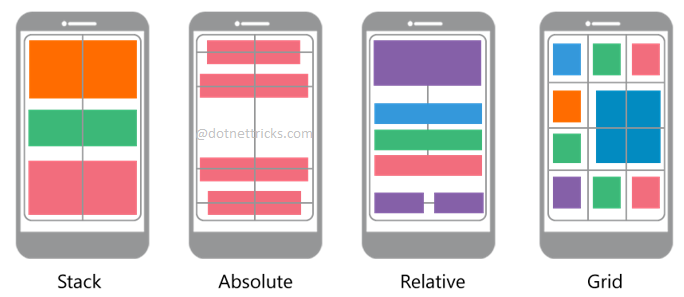 LayoutsDescriptionStackLayoutPositions the child elements in a line. Most commonly used layout.AbsoluteLayoutA view that positions child layouts at specified positions using anchors to define the placing and size.RelativeLayoutPositions the elements relative to each other using constraints.GridArranges multiple views in rows and columns just like table.
Cells
Xamarin Forms cells are specialized elements used for customization of items in a list. These describe how each item in a list should be drawn. Cells is used with ListViews and TableViews for items customization.
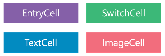 CellsDescriptionEntryCellA cell containing a label and single-line entry element.SwitchCellThe same as a switch, but with a label before it.TextCellA cell containing both a primary and a secondary text field.ImageCellA text cell that also contains an image.
What do you think?
Thank you for your time, I hope you enjoyed this article and found it useful. Please add your comments and questions below. I would like to have feedback from my blog readers. Your valuable feedback, question, or comments about this article are always welcome.
Take our free skill tests to evaluate your skill!

In less than 5 minutes, with our skill test, you can identify your knowledge gaps and strengths.
